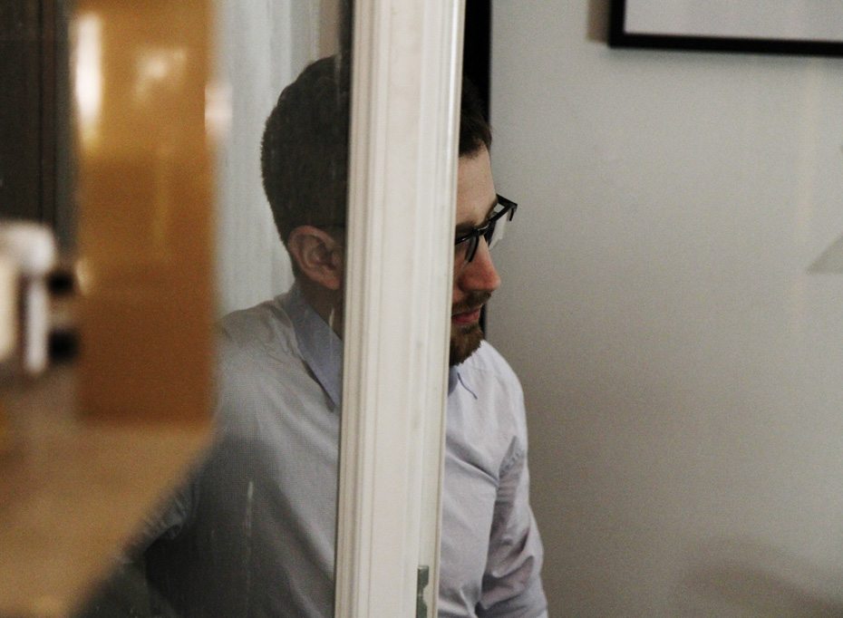
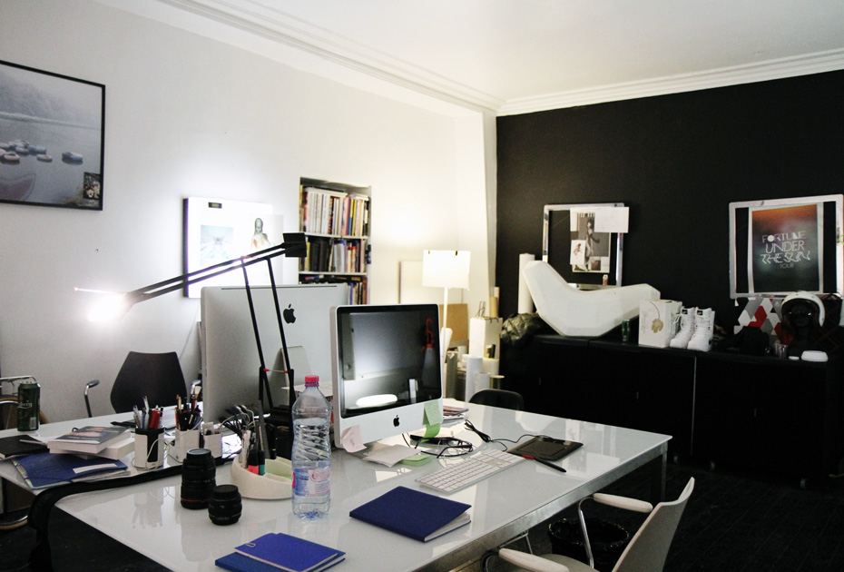
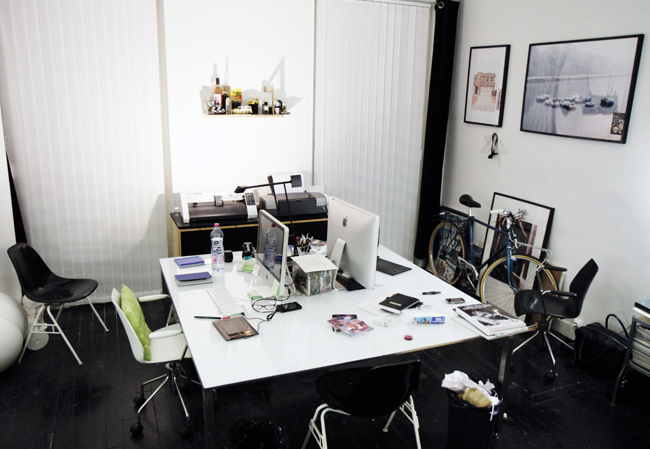
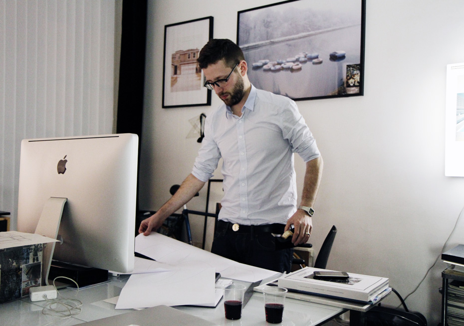
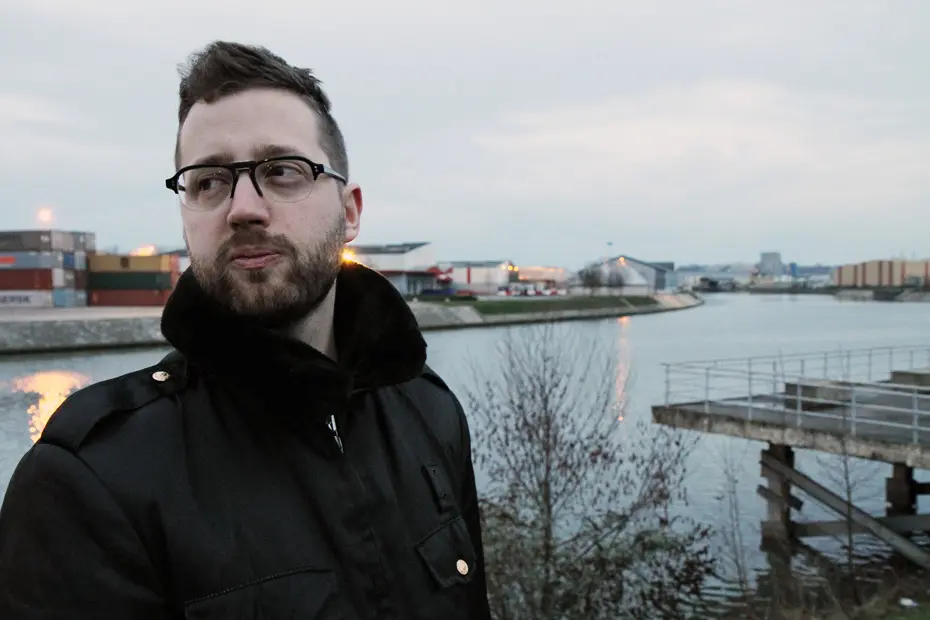
Etienne Bardelli, the man also known as Akroe, first became famous for his graffiti and later earned esteemed success in the 2000s following his work with album covers. He was born in a small town in Jura, in eastern France, in the midst of industrial ruins. At the age of 19, Bardelli moved to the Strasbourg Saint Denis area of Paris, where he still resides today. He is not one of those graffiti graphic artists who want to be exposed in a gallery by any means; illustration is of little interest to him. He prefers heavy, monumental installations which are often inspired by industrial design. Having been commissioned during the last Nuit Blanche in Metz as well as by its Centre Georges Pompidou, Bardelli has had a surprising journey from his amazing paintings in the industrial wasteland in Jura to the gates of contemporary art museums.

Where are you from?
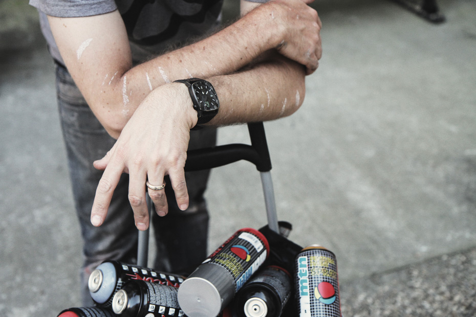
I live and work in Paris today but it does not matter so much. However, the region where I grew up, Jura, is of more interest to my current work and will always be an inspiration to me. Jura is a mountainous region, a little secluded in the east of France, near the border of Switzerland. In the 1990s, abandoned factories made a wonderful playground for the tagger I was back then. So I’ve spent a lot of time there and somehow ended up appropriating these places. In addition to having developed a certain visual sense and a sense of space there, I think I managed to develop a personal universe that is heavily inspired by industrial design and architecture, probably with a touch of romance that could be associated to the ruins. Even if it’s a cliché, there’s also a certain cynicism about the failed utopia of the industrial system in general.
You’ve lived in Paris since 1999. How would you describe your relationship with the city?
I came here to work and I always saw Paris as an ideal meeting place, a gathering point for a special kind of crowd. This has always defined Paris for me. I have my bearings and my favorite neighborhood (Strasbourg Saint Denis) but I’m not so sensitive to the city itself, and its beauty, even though that is the main element of the richness of French culture. And even when I have some free time to walk around, it’s impossible for me to tame the city. I always feel like I’m just passing by. Although I love France, and even Jura, I do not need to belong to a specific place.
What were your ambitions after your graphic design studies?
Doing what I like. Album covers mainly, and visual identities in fields related to music or the culture of my generation. I did not really have a clear idea but it seemed clear to me that these projects would be jeopardized if I stayed in my home town. Painting was a sideline. As it was illegal, I never really planned to do anything with it. It took me quite a while to realize how important it was for me.
You became known for your work in the music business, do you still work in this field?
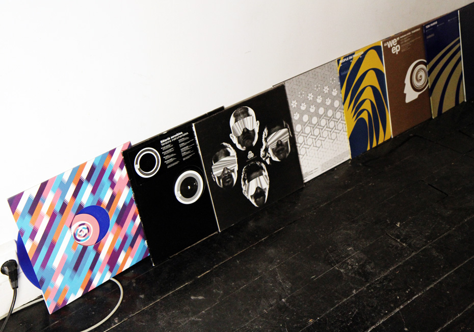
I made my first album covers at a time when the myth of the artist passed through the physical medium, the CD and vinyl. According to the impressions of the artists, these objects can inherit an almost religious quality which contributes to the care we give to these formats. So the idea of telling a story on a cover was very exciting; it’s not just a picture in a frame. I made hundreds of covers in seven years. After being the artistic director of various labels, I lost my motivation. This was undoubtedly due to the lack of opportunities for the image itself and the challenges the medium faced in the age of the Internet. I put a stop to it and that was a good thing because I was then able to devote myself to many other projects. Lately I started creating some covers again, for bands that are close to me, but my approach is quite different today.
You went from music to fashion …
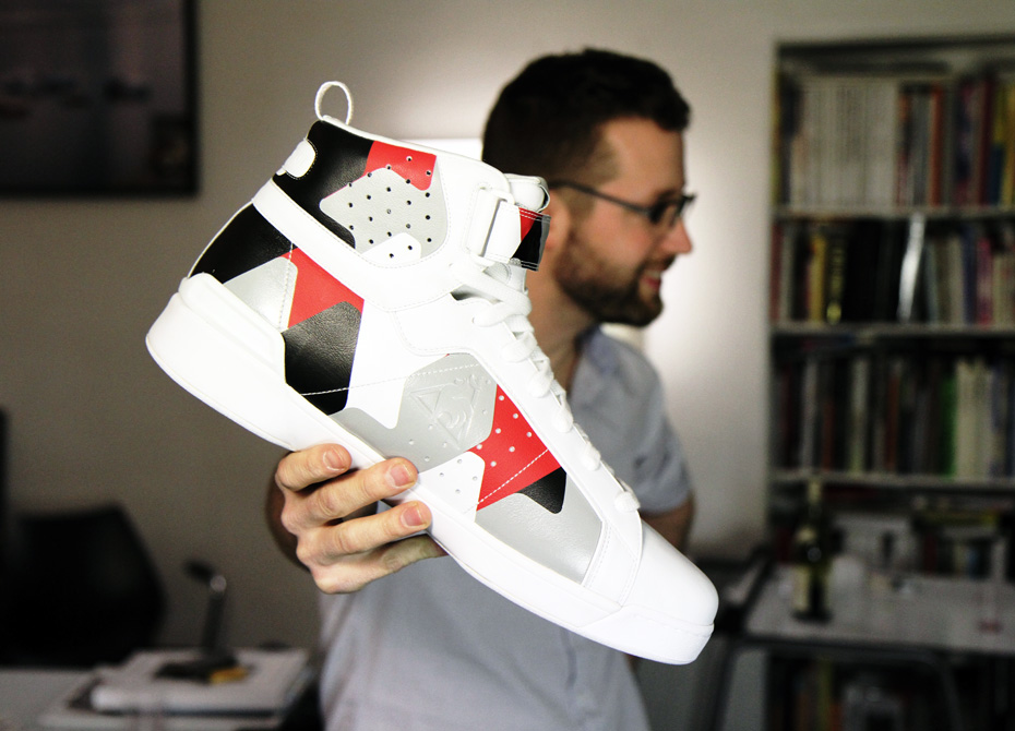
Yes. They are quite related fields so it’s a fairly natural progression for artistic directors. My main collaboration was with Sixpack, a multi-artists brand. We started with simple t-shirts and ended up with rather big collections, look books and campaign visuals. The challenges of this collaboration were interesting: they were not those of an already established brand but those of a young brand that had to define and assert themselves, which obviously required some artistic individuality but also permitted a lot of freedom. I recently worked with Nike on a small collection of snowboard clothing and I continue to consider projects, with a very personal artistic universe going far beyond textile design, like this one.
You do not limit yourself to graphic design. In light of your recent work you could also be qualified as a visual artist, right?
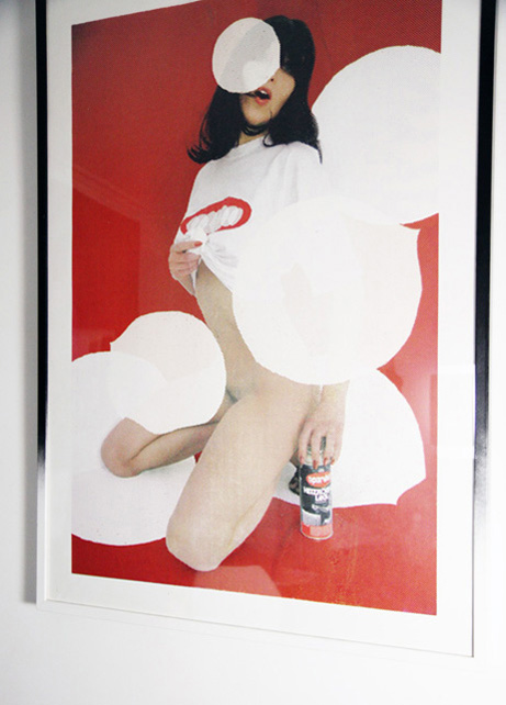
True. Graphic design is an ideal means of expression for me and it is the common theme of all of my projects. The advantage, with my fairly minimal way of conceiving graphic design, is that I can adapt it to a variety of media. The approach is quite similar to that of design. This evolution has taken place in my work quite naturally and has established itself more and more with every exhibition I did. I have always worked with space and volume, aiming to reinterpret the exhibition space and respond to different contexts. It is impossible for me to just present simple graphic design productions, posters or album covers. Apart from a few cases, I find that graphic design exhibitions have a great weakness in their submissions. For me, graphic design finds its strength in a wide diffusion and in a real context. To isolate it in a gallery often seems irrelevant to me.
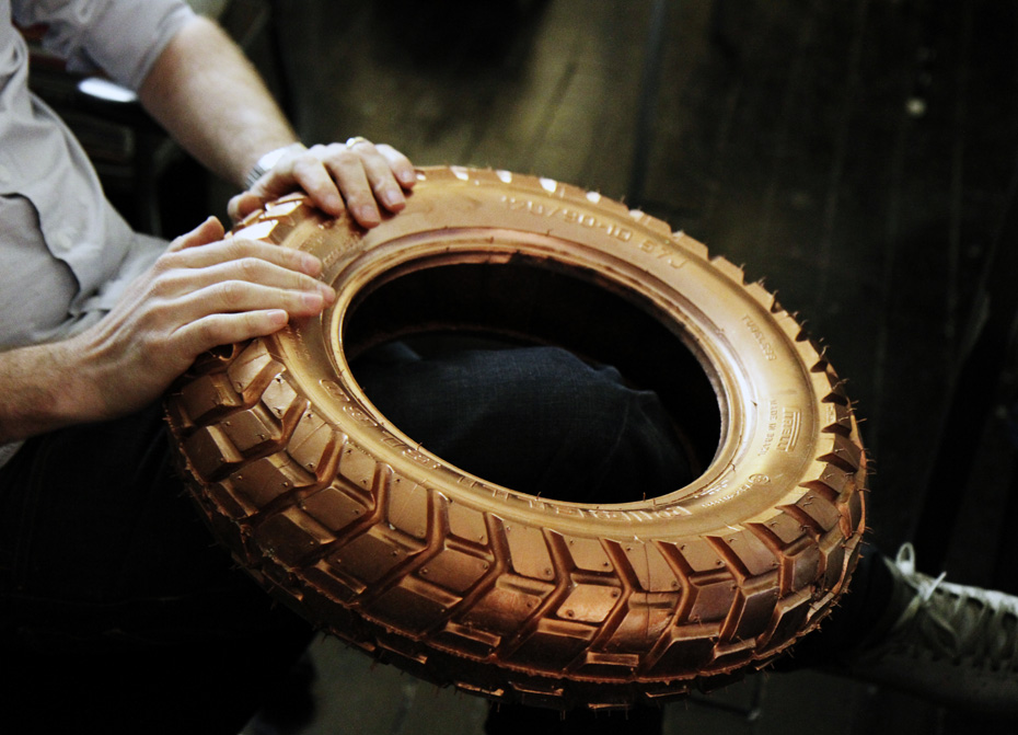
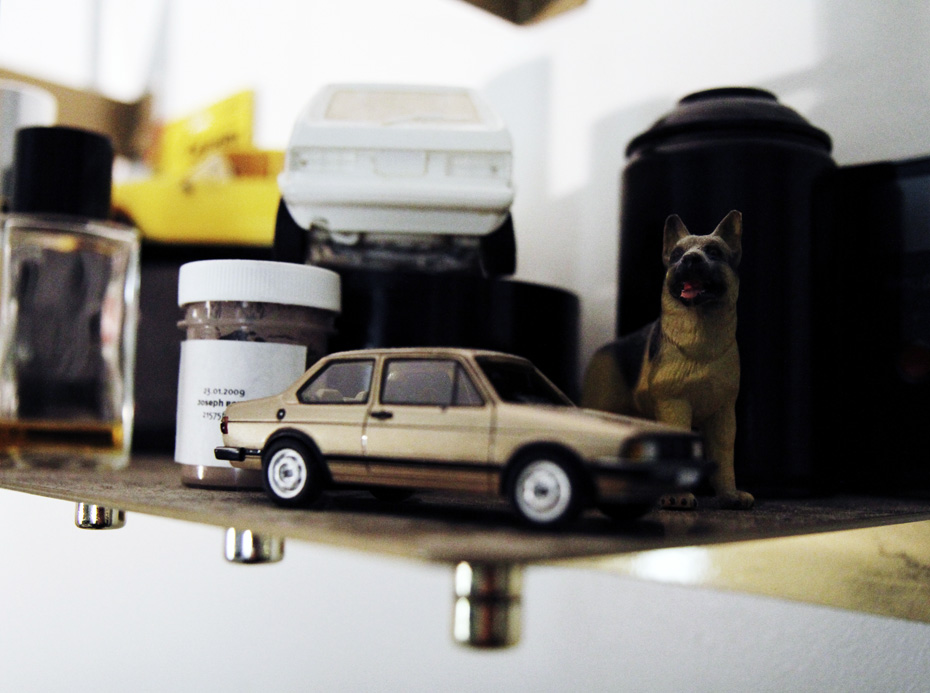
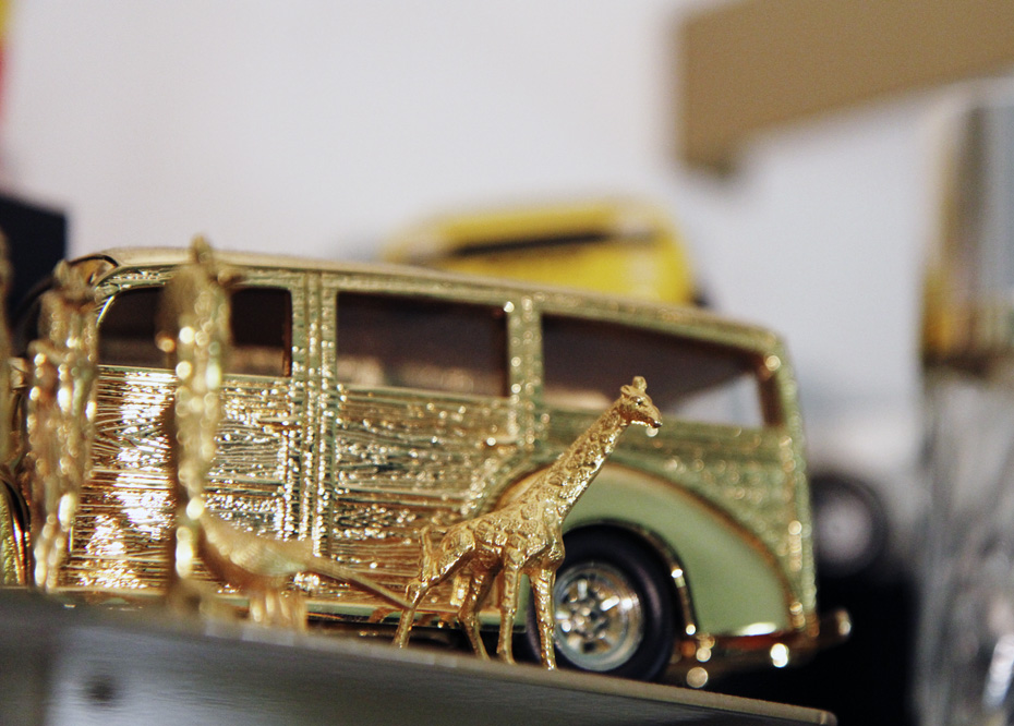
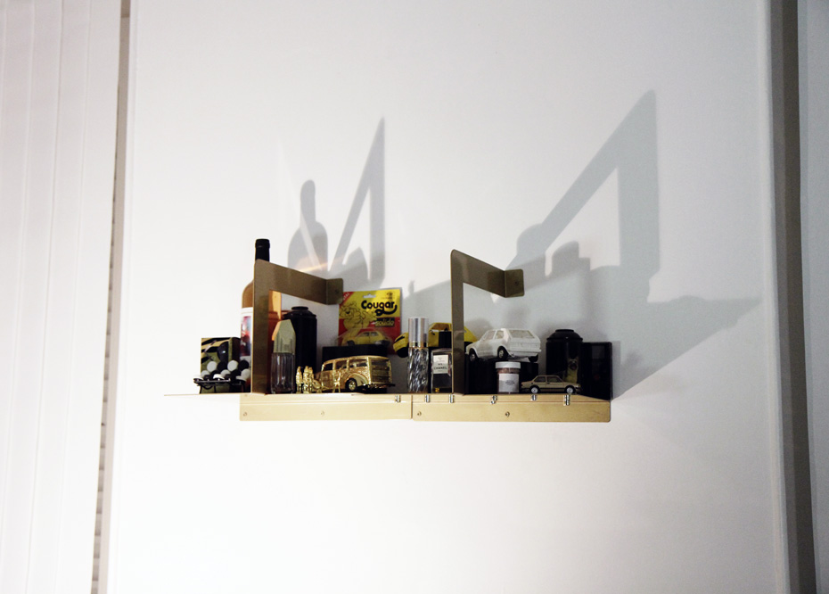
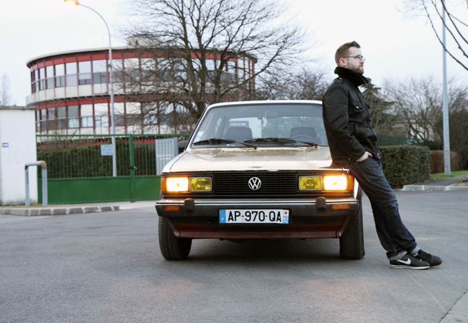
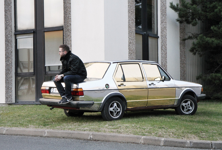
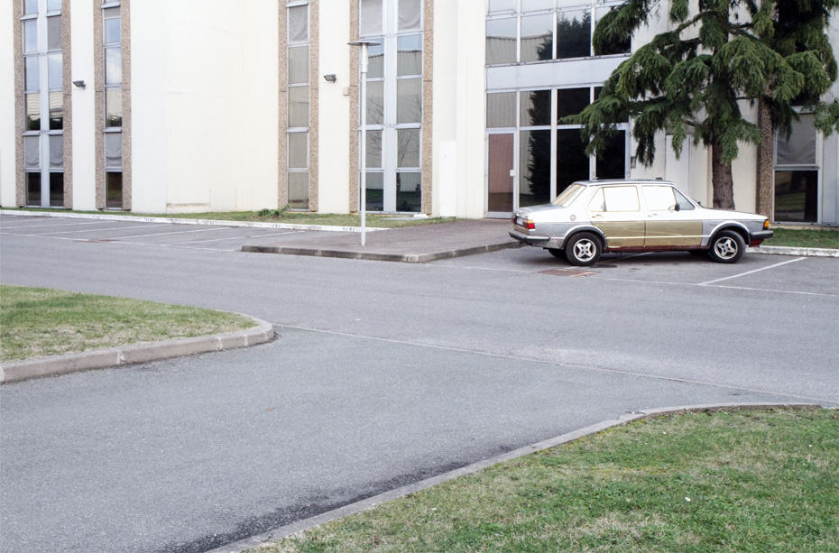
Aside from my exhibits, I started some personal projects like the Herla King series that is inspired by the Polo Harlequin and especially by those “design accidents” on cars whose parts were replaced because of breakage. I see this as a kind of humanization of industrial production. I have collected many photos of these odd cars and decided to produce visual accidents of the same car my father owned when I was a kid, a VW Jetta – a very rectangular, strict and symmetrical car.
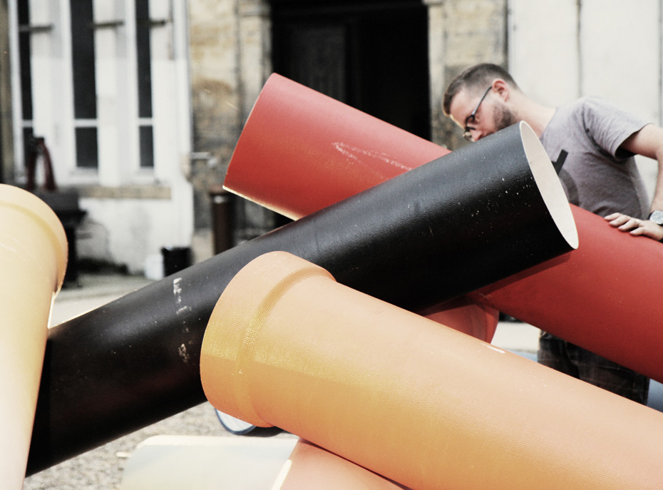
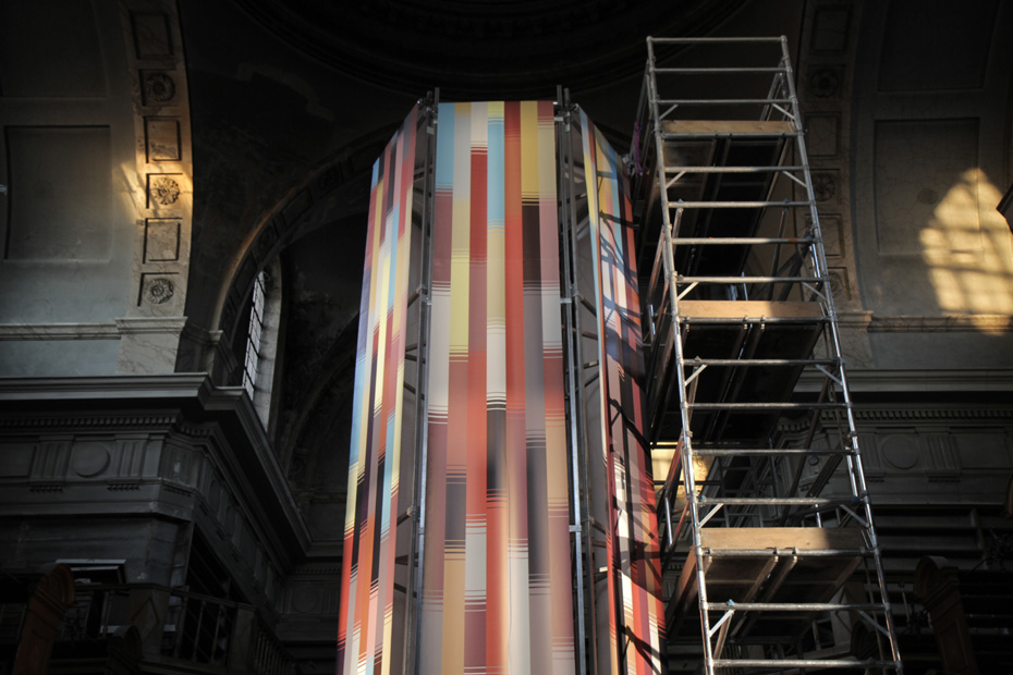
Other projects also push me to evolve in purely personal ways, like my installations for the Nuit Blanche in Metz in 2010 and this year in 2011. These were technical challenges of rare complexity, which were truly in tune with my way of thinking – to intervene in an unusual place and to produce work directly related to the context.
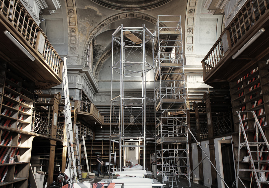
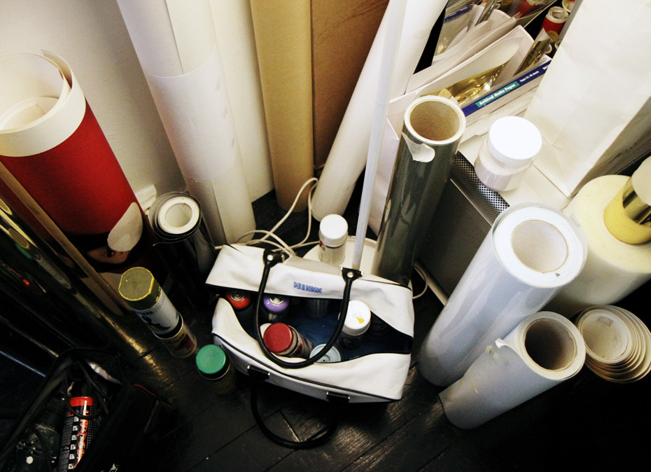
My latest installation, Summus Faber, is a device inspired by the printing press, made of paper rolls that intersect to form a moving tower in the middle of a chapel. This chapel was abandoned for thirty years and a library had been installed there. The installation refers to Saint Eligius, the patron saint of mechanics and metal workers. With this reference I intend to represent the sanctification of industry.
Are you obsessed with industry?
Industry is the vector of production, which all humans are obsessed with. Speaking of which, I thank you for your good work but stubborn as I am, I must unfortunately return to the production of my own…
Thank you for the interview!
To find out more about Akroe and his works please visit his website www.akroe.net
Photography: Arthur Delloye
Video: Ilan Rosenblatt
Interview: FvF
Translation: Mascha Kaessner
