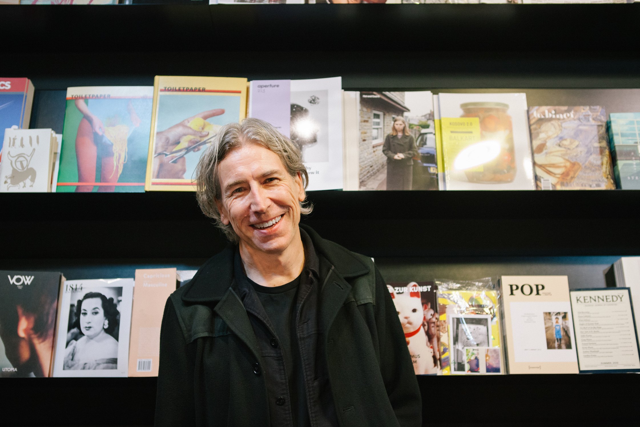
Managing and creating magazines for 25 years, Jeremy Leslie is one of the best people to turn to in publishing and was delighted to converse about the development of publishing and the “here and now of magazines.” After his studies in graphic design from 1979 to 1984 at the London College of Printing, he was appointed Art Director of Blitz. Following this he held a three year position as Art Director at „Time Out“, and spent time as Creative Director at John Brown Publishing where he managed a range of iconic magazines and corporate projects for international brands.
Today he runs his magCulture studio, working as a designer, writer, and curator. His blog magCulture has become an indispensable must-read for magazine lovers and critics worldwide. Recently he has published his third book “The Modern Magazine” that investigates editorial design.


Jeremy put almost a decade of work into this publication, compiling a summary of the most influential contemporary magazines. Over four chapters “Rethinking the Magazine“, “Reinventing Genres“, “Design x Content“ and “Print x Digital”, Jeremy proves his skills in art direction, writing and his motivation to present different angles on every single page and through every single word. “The Modern Magazine” sketches publishing history, while underlining experimentation in various genres, and unites key characters industry figures that include: Mike Mieré, Fantastic Man Co-Founder Jop van Bennekom and Marco Velardi – Editor-In-Chief of apartamento. The book outlines new publishing possibilities in light of the digital era that has forced editors and designers to rethink their roles beyond the question of relevance for print based publications.
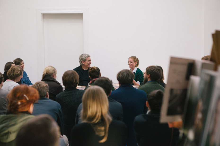
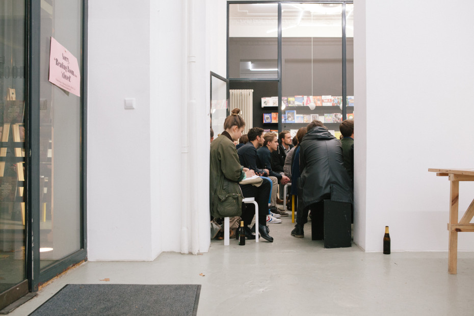
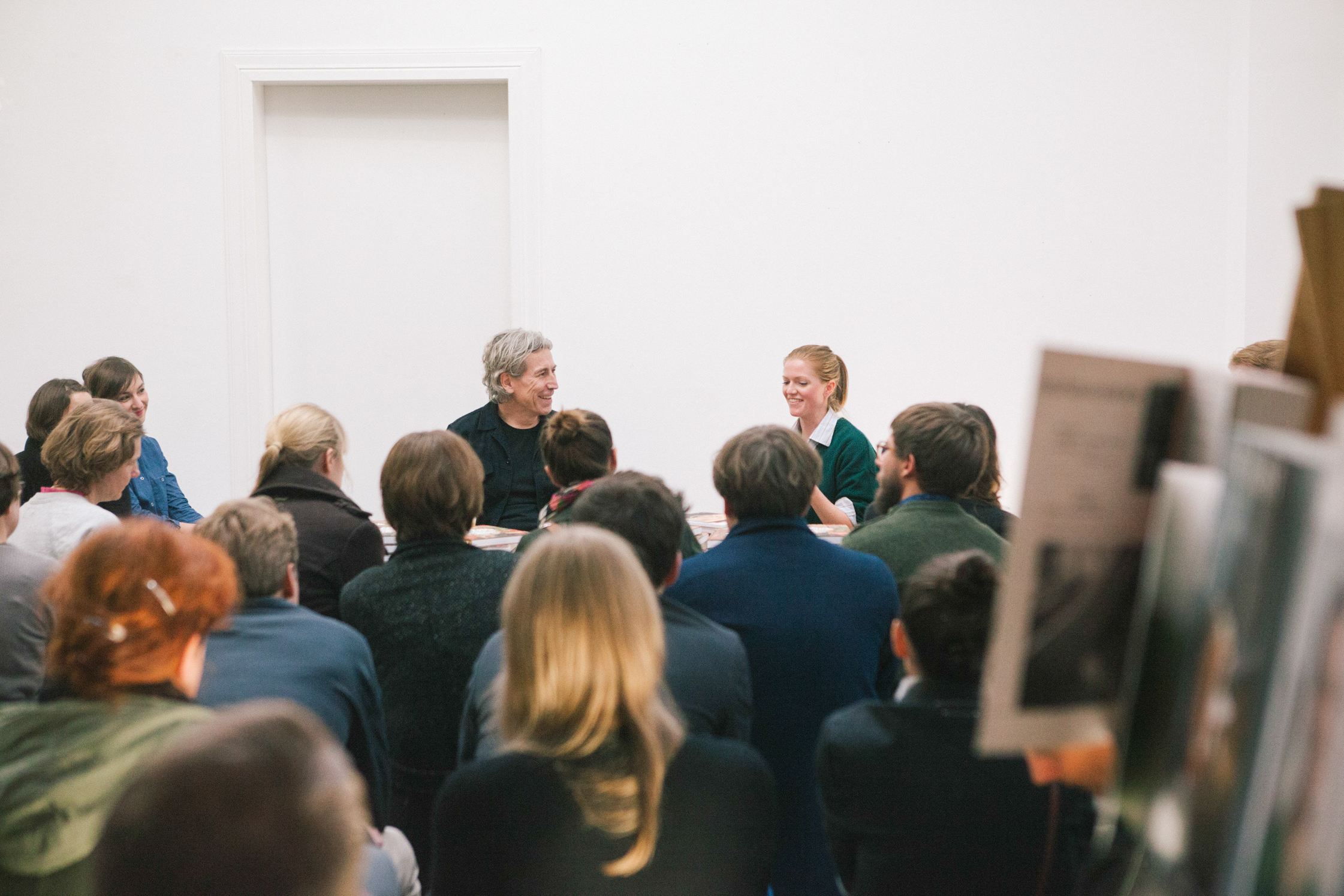
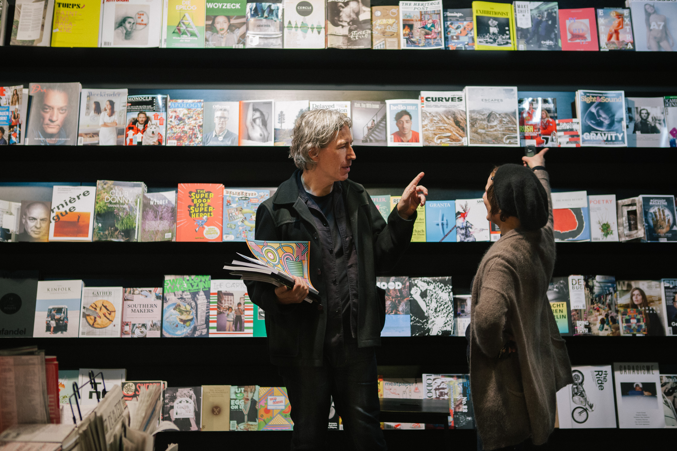
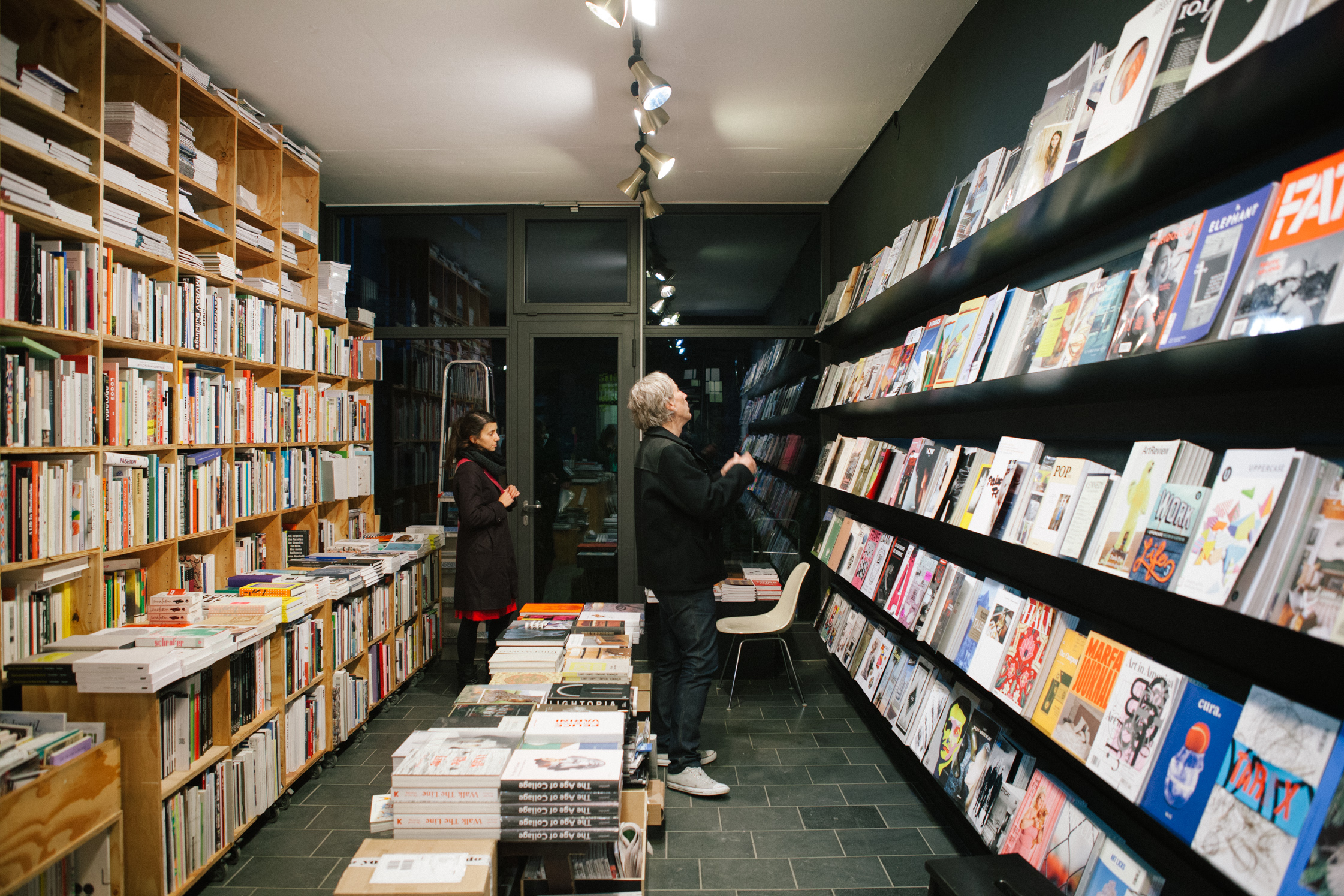
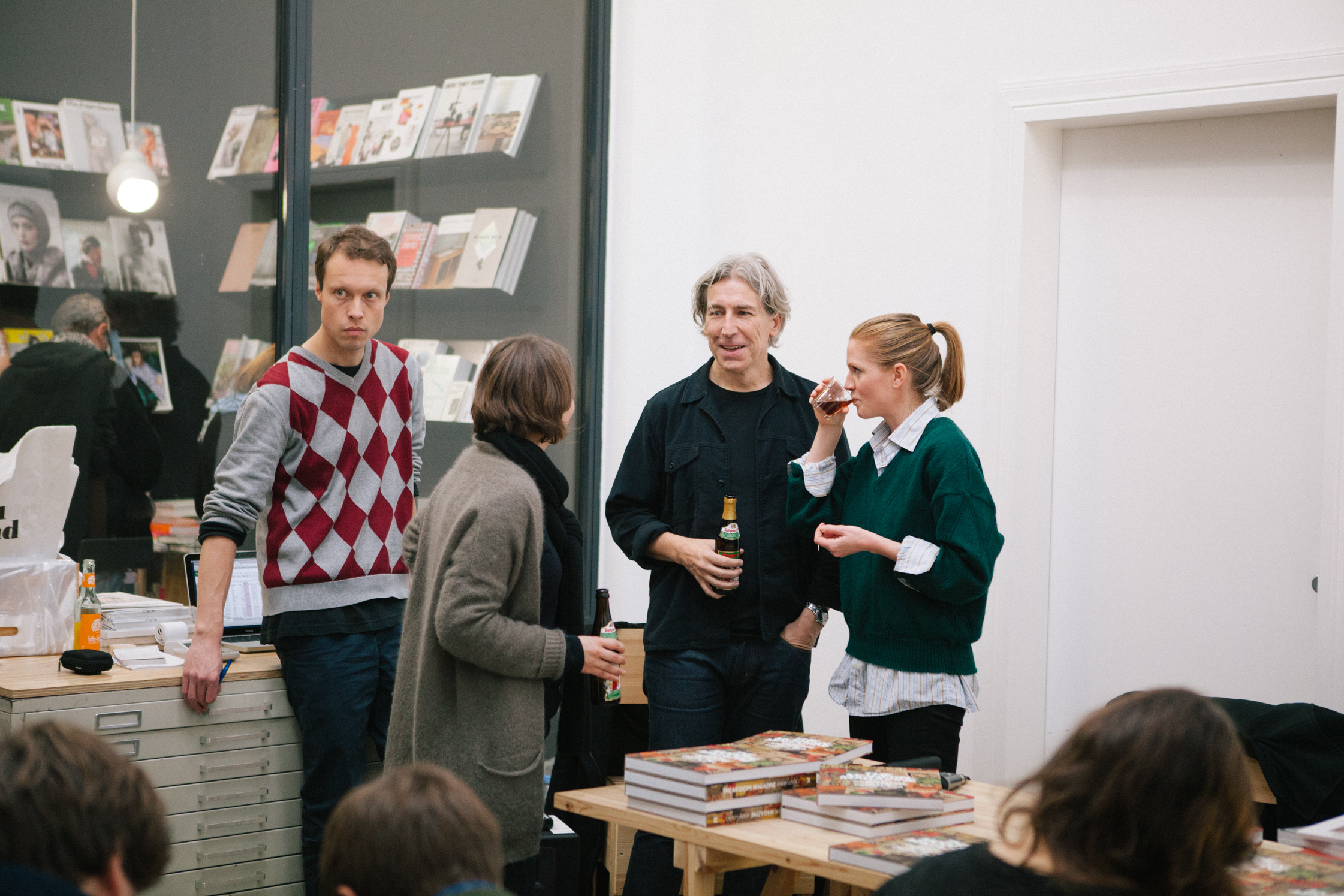
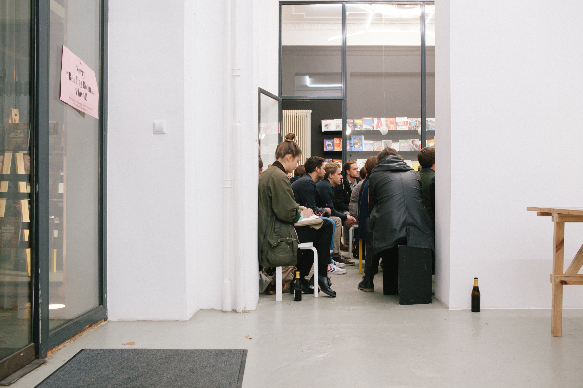
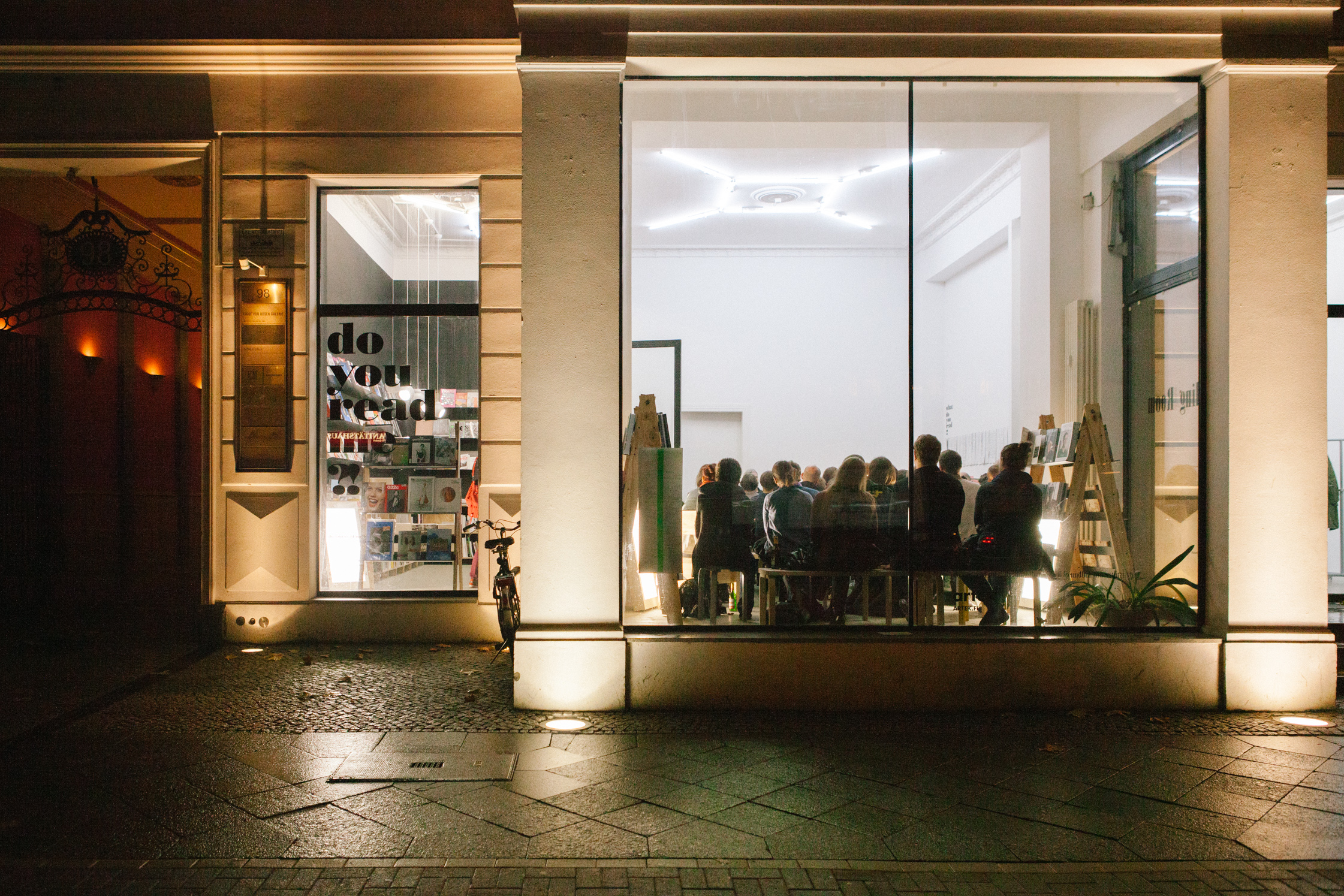
We spent a pleasant afternoon with Jeremy at do you read me?!, talking about his career, the concept of his book and his unique claim to the contemporary publishing scene. Furthermore we asked him to choose five of his favorite recent magazines and accompanied him to the Reading Room – do you read me?!’s location for lectures, exhibitions, and discussions – to present “The Modern Magazine”.
When and why did you start working on “The Modern Magazine”?
The idea for this book arose ten years ago. I had produced two books already – “Issues” in 2001 and “Magculture” in 2003. The reason why I started my blog that is also called “magculture” was to have a research tool for a book. Of course I kept hearing about other people working on publishing books about magazine design. I thought “one of them will do the book that I wanted to do”, but then they came out and were different to my idea and approach.
At a time, when everyone seems to discuss the big gap or the fusion of print and digital? Why did you decide to publish it now?
I want to move the conversation beyond the question of “is print really dead?” That’s enough. It is a lazy headline and a boring topic. One medium doesn’t just replace another. I hope we can draw a line beyond all that nonsense. There is so much happening. With commercial and niche magazines. At the moment the industry has to face so many challenges, but it doesn’t mean we have to look away. More people are willing to take a risk. There is less to lose and more people are experimenting.
I believe that it is a golden age of creativity and magazine making. And I want to reflect that.
The book works on different levels. You worked on the entire piece, from concept to the art direction and written content. Can you explain the structure behind it?
The four chapters examine the different perspectives when considering a magazine. I first took a closer look at the notion of “eyecandy”. It’s indisputable that this is a big part of magazines. There are so many who prefer to be entertained by looking at a magazine, as opposed to reading an issue of The Alpine Review or The New Yorker. They’re just flicking through. And that is not a bad thing at all. You can also take out the text from “The Modern Magazine“ and just read the captions.
But besides the fact that this is the part I enjoy in my work the most, the relationship between content and the layout is extremely important. The visual journalist is someone who at least has a point of view or knows how to judge writers. I am also seeing a lot of art directors becoming writers.
What was the most challenging part of the process publishing the book?
I had piles and piles of magazines to sort through – it took me ages to edit them down. Furthermore each issue of each magazine has a hundred pages. For every category and for every page I had to ask the question “which page represents this particular magazine and reflects the message I am telling with that page of my book?” I met with key players and chose the most distinctive quotes to convey the meaning and idea behind a concept and design the best.
I hope that my book explains that there are so many interesting things going on and that magazines have a certain role in leading people. They do so visually with their content and the different levels of storytelling. Magazines suggest and reflect what is out there in the most solid way.
Jeremy, please show us some of your favorite magazines.
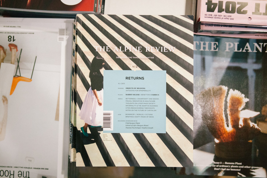
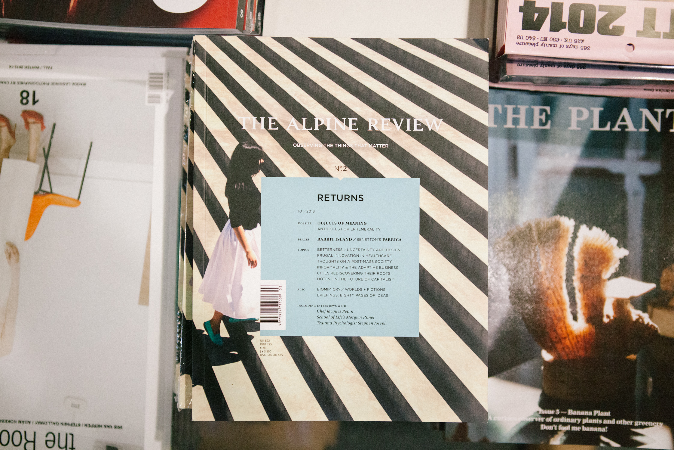
The Alpine Review
The Alpine Review is maybe not the best example of design but it simply has fantastic content. They narrate with a broad outlook from Montreal and provide a general overview, dealing with different topics. Lots of magazines are trying to fill niches, The Alpine Review reaches a level where they can write about almost everything. And you will listen. The quality of the writing and the people that are involved are outstanding. Topped with a lot of surprises and little snippets, it is a masterpiece. The Alpine Review comes out once a year but it takes almost a year to read it as well. In the best way.
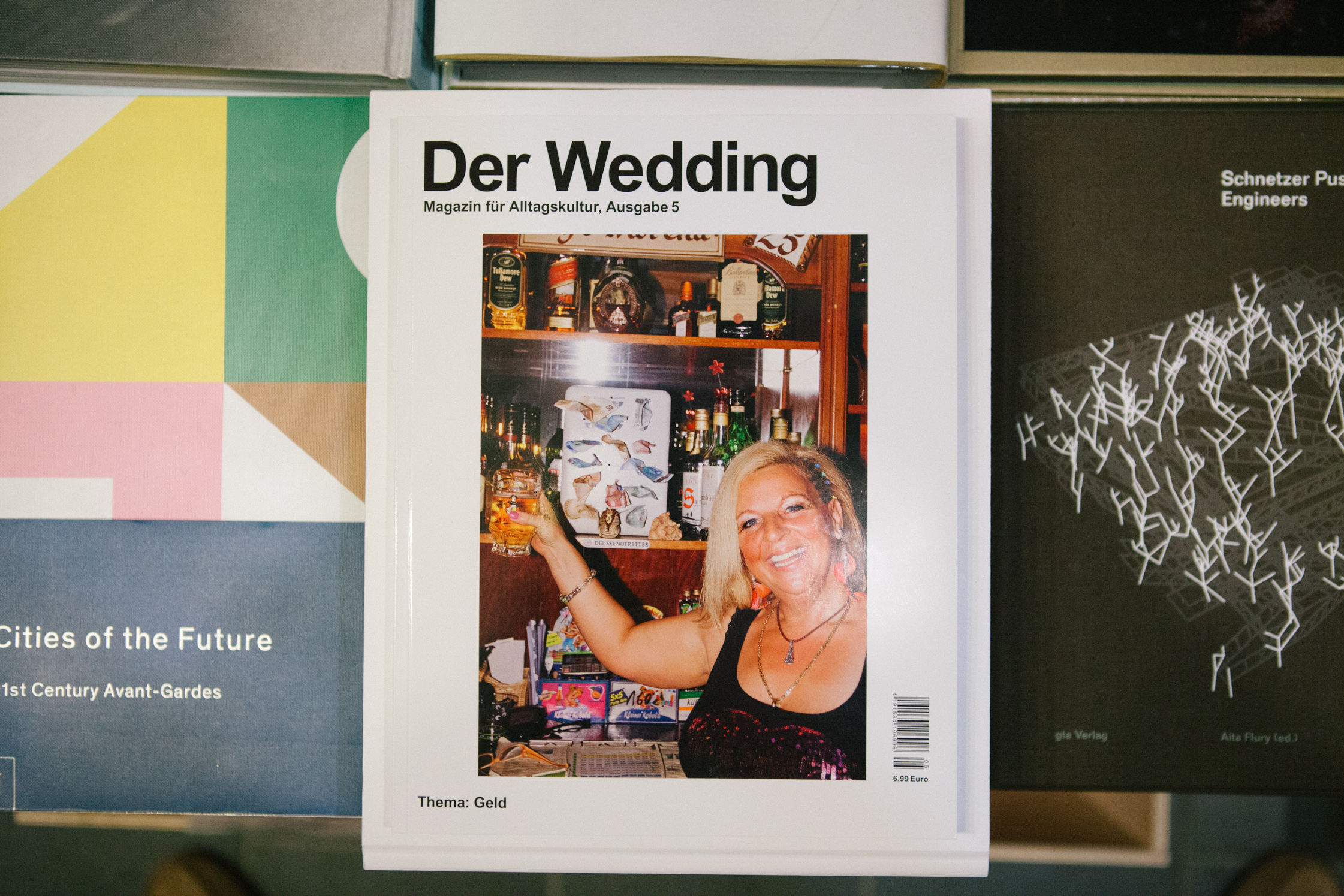
Der Wedding
Der Wedding represents the opposite of the general trend of being in a city and looking to the world pretending being global. It focuses on everyday local culture in close proximity. The area of Wedding in Berlin is a diverse district because of the mix of people living there. The problems of city society generally come through this magazine very well. It displays the challenges of living in that part of the city with one main topic every issue and is filtered through very well. Other magazines that are doing something similar, include the Berlin based Flaneur and Local Quarterly from the US.
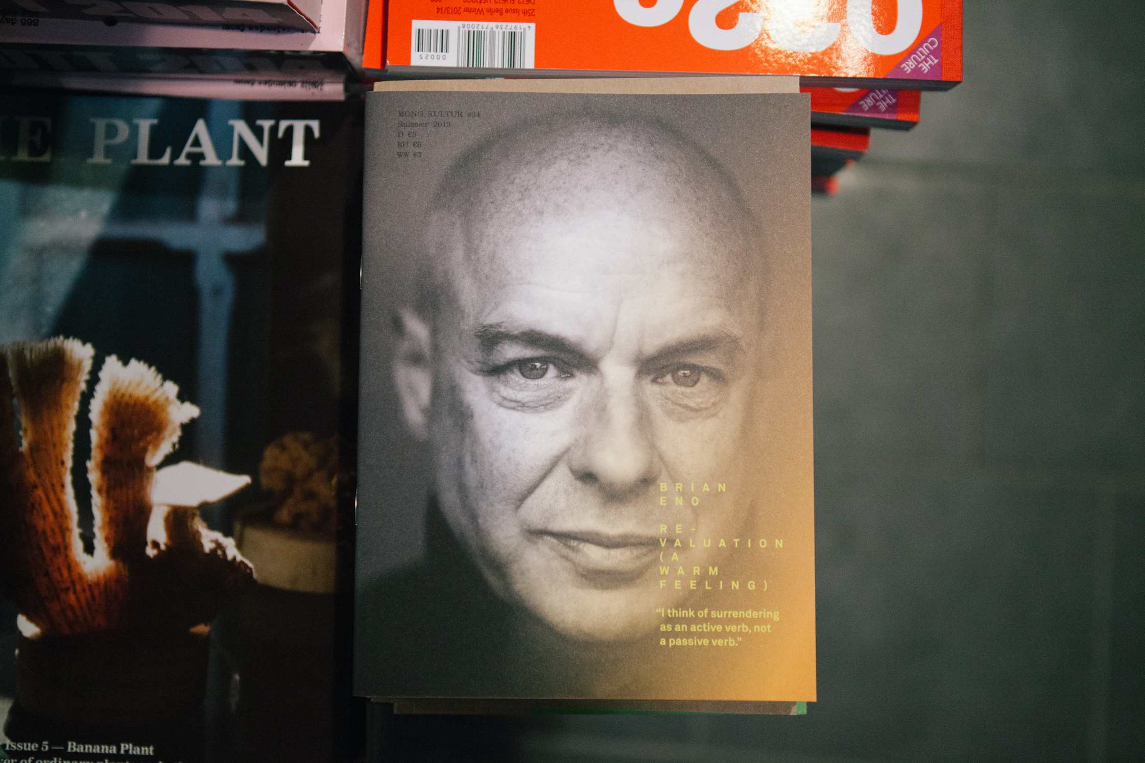
mono.kultur
mono.kultur just released it’s 35th issue. It is such a simple concept and pretty much the opposite of The Alpine Review. It has the same love and attention for detail but it focuses specifically on one person and one interview. It is the same size every time but adapts its presentation. The most recent issue is about Brian Eno. You might like him or hate him. But you definitely want to read what he has to say. mono.kultur is a perfect example of a really simple idea, which is perfectly executed.
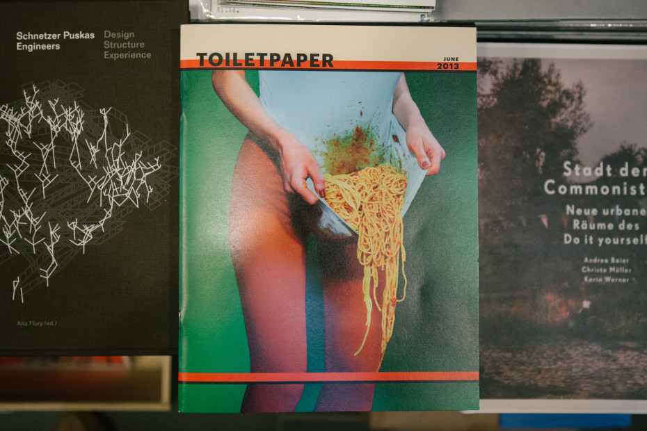
Toiletpaper
Toiletpaper is in my book for the photography. Made by the publishers of Permanent Food which, despite its name is all about found materials, juxtaposed to create new meanings. Toiletpaper goes in the other direction using the techniques of advertising photography to create disturbing images.
In the recent issue there is a double page of a zipper and a tongue caught in it – at least that’s what you believe you see until you recognize that it is actually a testicle. They use all the techniques of retouching and removing blemishes to make nightmarish images.
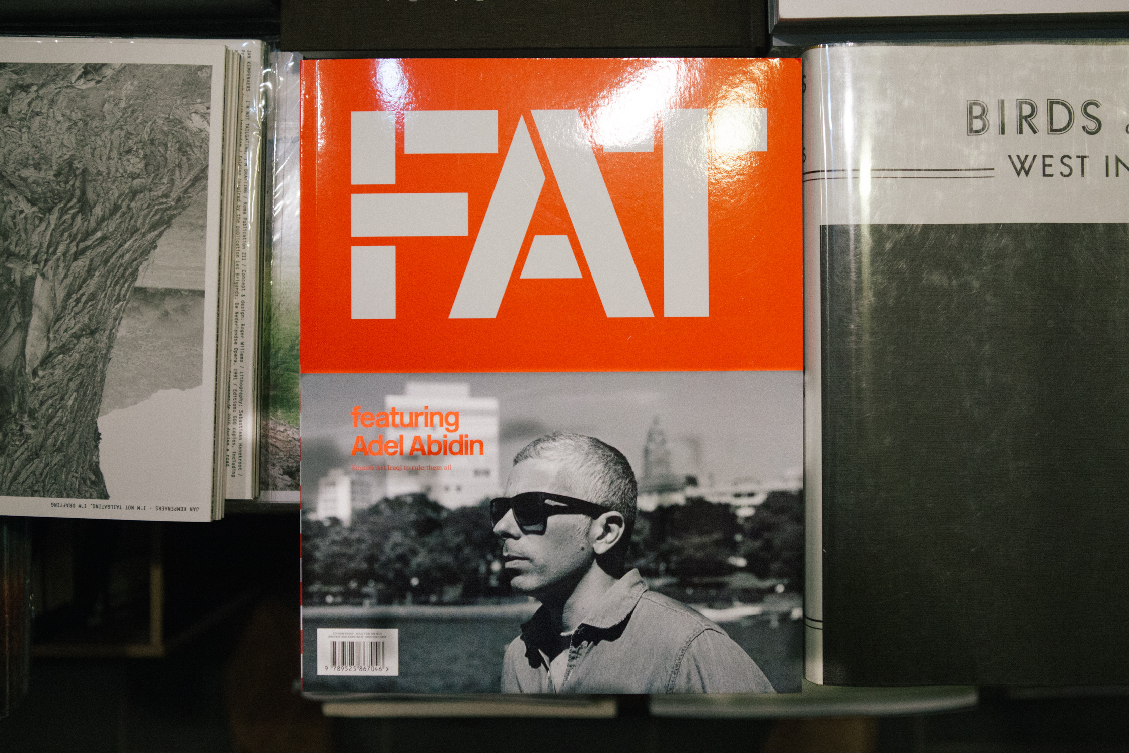
FAT
I just read FAT on my flight to Berlin. Its from the team of Kasino which used to be one of my favorite magazines a couple of years ago before it ended. It was a great example of editorial and design working together in unison.
It’s great that they came back with this new publication FAT which means two things; “Finnish Art Today” and “Famous Art Tomorrow”. It carries on where Kasino left off. It’s an art magazine about the craft of making magazines and plays the same linguistic games that Kasino used to. You will find a lot of beautiful details. Welcoming you from the first page with the text “Oh, you’re here already. Just a sec, I’ll make myself presentable.” The art content is split into three sections and each section has a little sayings throughout. For example the section “Galleries” includes text that subverts the normal rules of a gallery like: “Enjoy the art“, “Snacks allowed“ and “You may touch the art”. These details are really subtle and it is clear the creators enjoy themselves. You want to meet these people because you think you’ll get along with them.
Thank you, Jeremy, for your time and sharing your knowledge, sensitivity and insights with us. Please visit magculture here to find put more about Jeremy’s work and his publications.
With this Journal post we provide an outlook for an ongoing collaboration with Berlin based magazine store do you read me?!. Stay tuned.
Photography: Philipp Langenheim
Interview & Text: Zsuzsanna Toth


