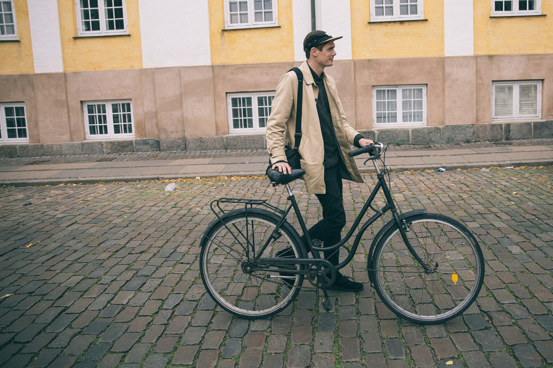
Lanky and bearing an almost-constant smile, Andreas Jarner is an affable young man who doesn’t always have the words to describe why he creates his spare, abstract work.
His prints feature textured objects contrasted against clean backgrounds. They are aesthetic and somber pauses that draw in the eye and leave the mind at rest. After finishing high school and traveling the world, at age 24, he started his first design company, KBHM. He moved on to study graphic design at the Danish School for Media and Journalism and now works in branding and corporate communication at the Copenhagen-based branding and design agency AM.
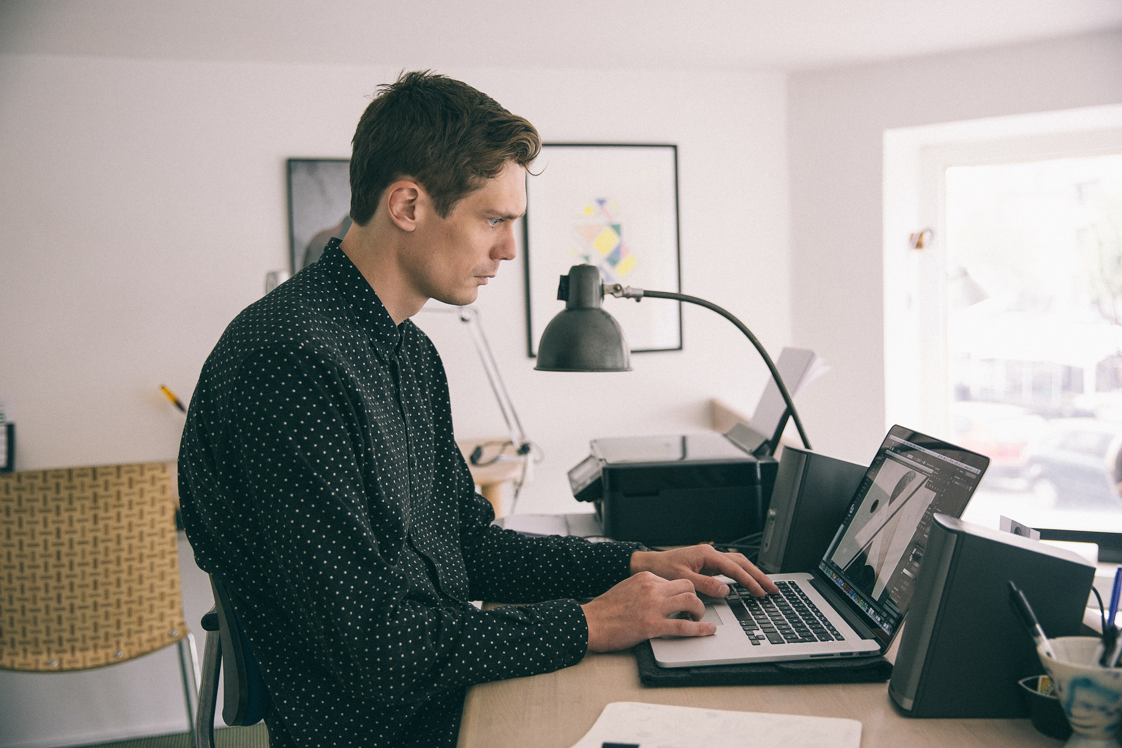
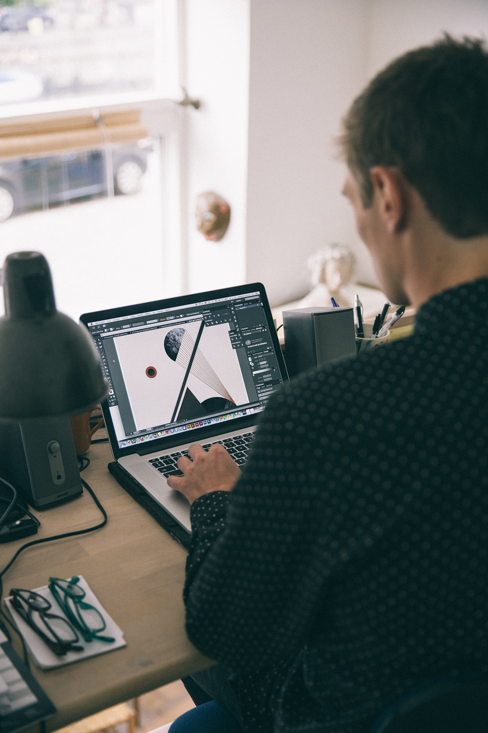
However, his creative output is not limited to the hours he spends at his desk. He works compulsively and intuitively, sketching and logging references and inspiration wherever he might be. He pulls on these resources to produce posters with a subdued Nordic minimalism, which is also reflected in his neat and unfussy appearance.
-
Tell us about where we are sitting and what it means to you?
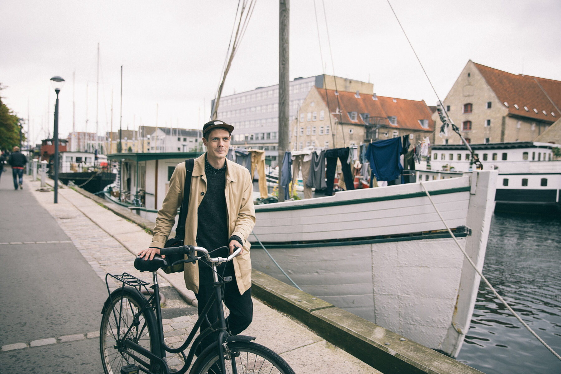
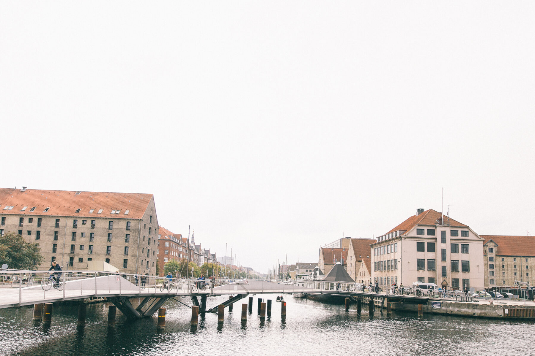
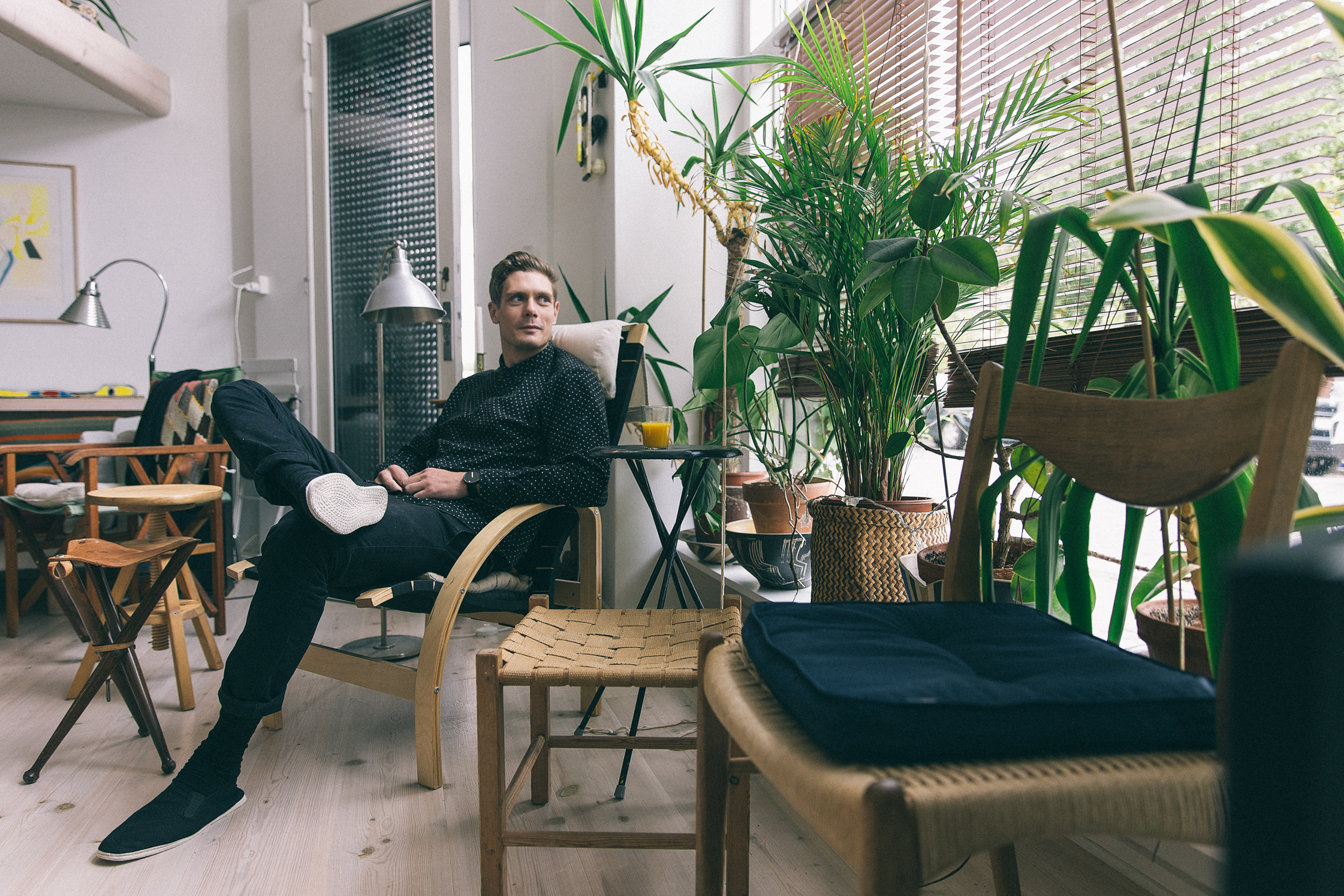
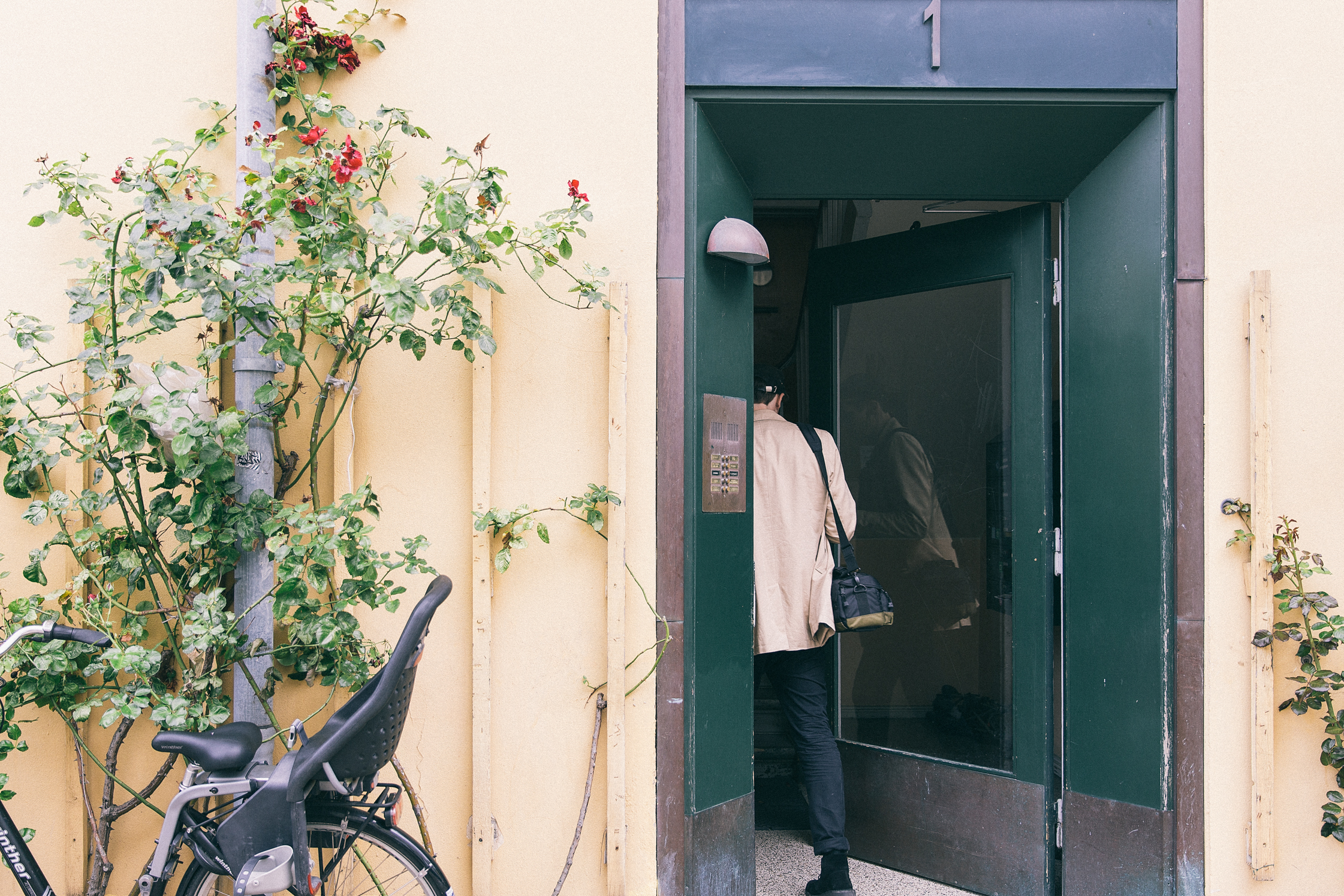
Right now we are at my parents’ home in the Copenhagen district of Christianshavn, an area of the city I lived in for the first 20 years of my life. I have now moved to Nørrebro with my girlfriend, but I often come here just to relax and work because I really love this part of the city, particularly here around the canals. My parents have a small boat parked nearby that I use a lot in the summertime. This room we are in now used to be an old tobacco shop – you can even see the shadow of the sign still on the window.
-
The house has a lot of art in it. Did your parents guide you at all?
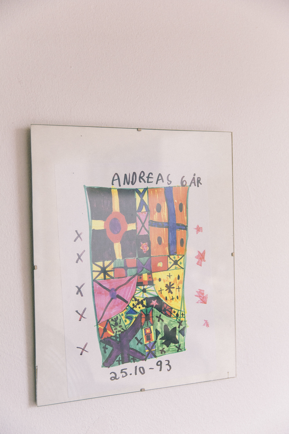
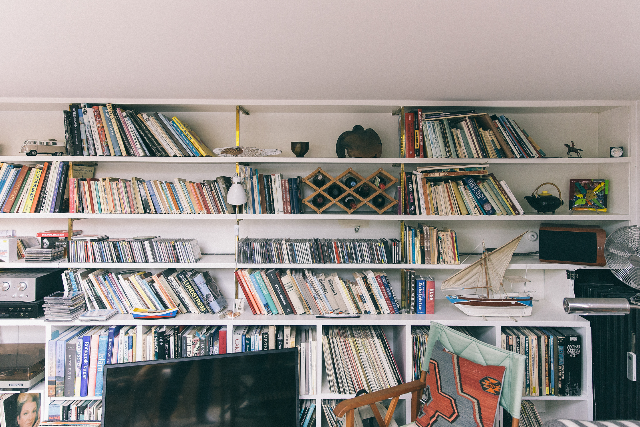
I have very creative parents and I have always loved being creative. My parents always made sure that the option was there if I wanted to draw. When I was seven I started to attend an art school for children twice a week after school, which is where I learned how to draw. I really liked it and when I turned nine I had my first exhibition in Aalborg in a museum for children’s art. I think I had several hundred drawings at the exhibition. When I got older, in my teenage years, I started to paint graffiti. Those were my “bad boy” years, I guess.

-
What attracted you to graffiti?
Producing something that can be really big and colorful. It’s easy to draw a little sketch but it’s hard to throw it up on a wall and keep the proportions right. I stopped doing graffiti after I got in trouble with the police a few times. But it was during that period that I fell in love with typography and I started to see letters as shapes and not just readable objects. I know it sounds very nerdy – and it is!
-
When did you first realize that you wanted to be a graphic designer?
At first I thought making creative stuff was just fun. When I was young I drew landscapes, buildings and people before moving on to graffiti, then more digital and abstract art. I first found out that I could pursue graphic design as a career when I was in high school. I immediately knew it was the perfect job for me, because it would let me work with typography, layout and composition, which I already loved. After I left high school, I started a small company, KBHM, with a friend, where we started to test out web and graphic design. It wasn’t ever a serious business, but it was a lot of fun and we got some clients. That meant, for the first time, seeing my work around the city, which was weird but nice. After a few years, I started at the Danish School of Media and Journalism, where I studied graphic design.
-
Why is good graphic design important, and why should people invest in it?
Good graphic design can help a client to stand out in the market with a unique visual “face.” But it’s very interesting to see how graphic design has developed. If we go back 10 or 15 years, a company would normally have one static logo and one or two colors. But nowadays designers work a lot more with open design systems where an identity for a company can be as organic as the company itself, so it can actually change or grow with the company.
-
Do you pay attention to design trends? Is that important in your personal and commercial work?
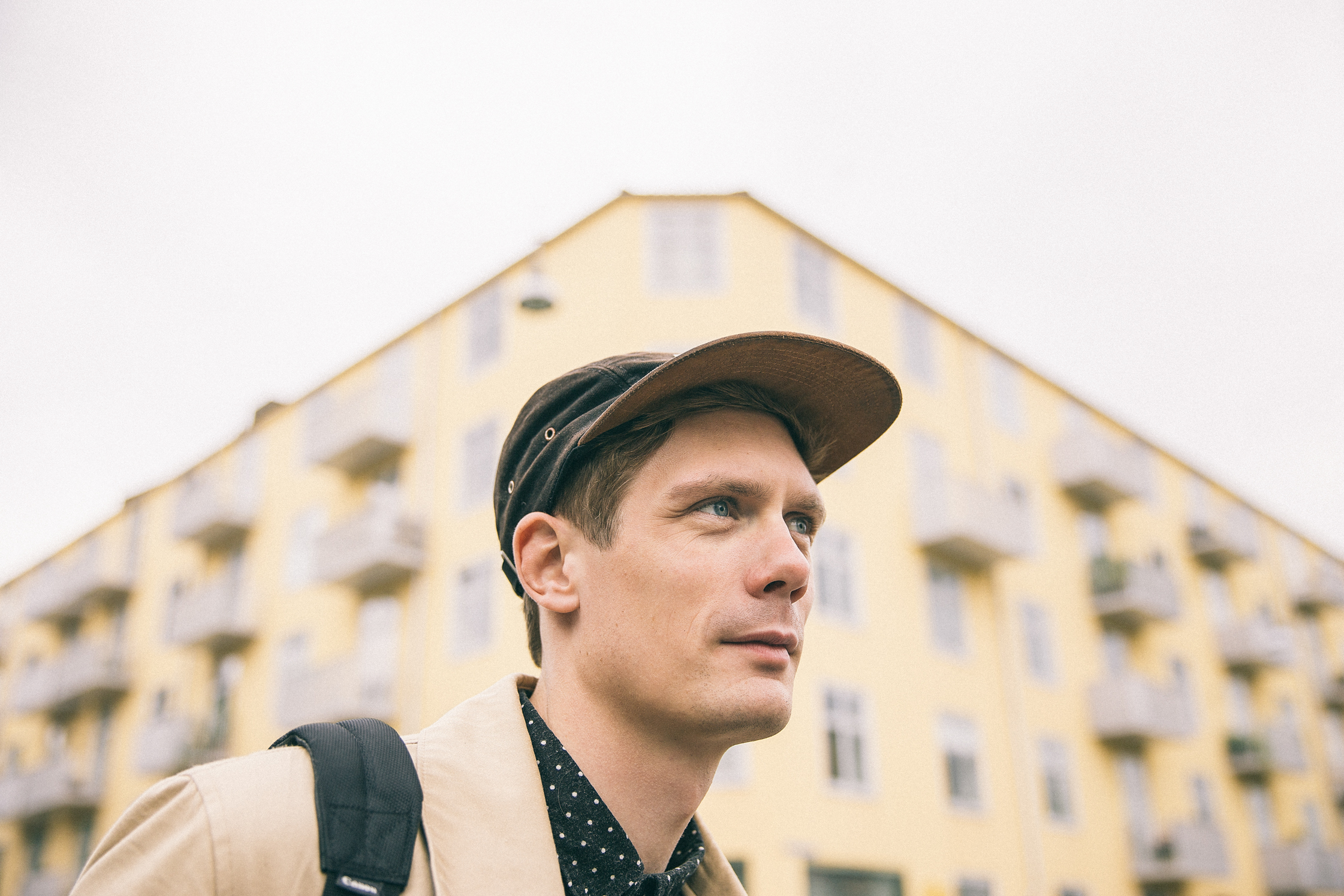
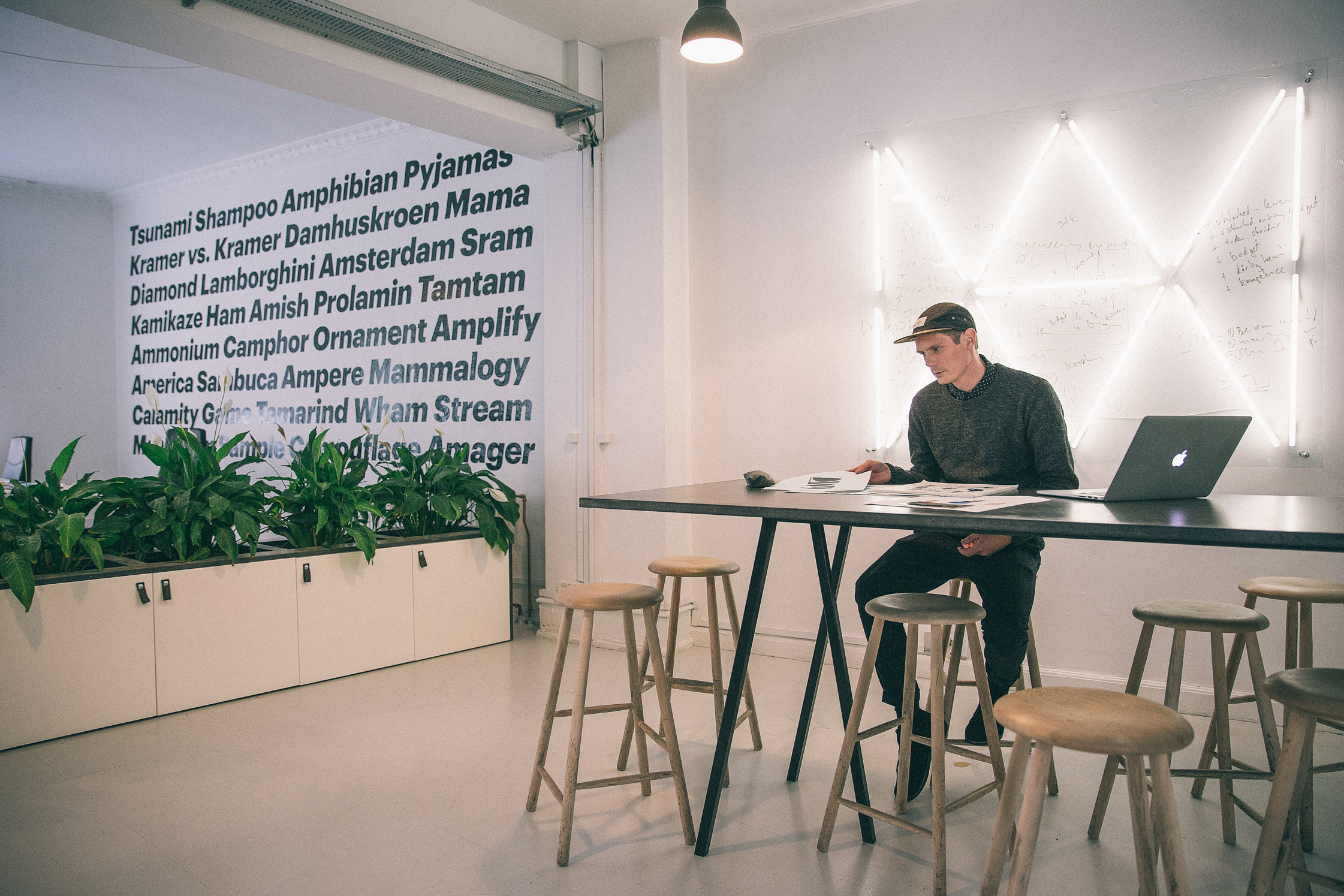
Yes and no. I follow some blogs and design agencies, which I use as inspiration sources in my personal work. But my commercial work is more about making the right solution for the client, so being trendy isn’t really that important. If you work for a cultural institution, like an art museum, it makes sense to create an edgy and experimental design and that is of course always fun for a designer. But it is also an exciting challenge to create a mainstream design that is for everyone, such as a visual identity for an airport.
-
Do you have different toolboxes for tackling different types of projects? Where do you find your inspiration?
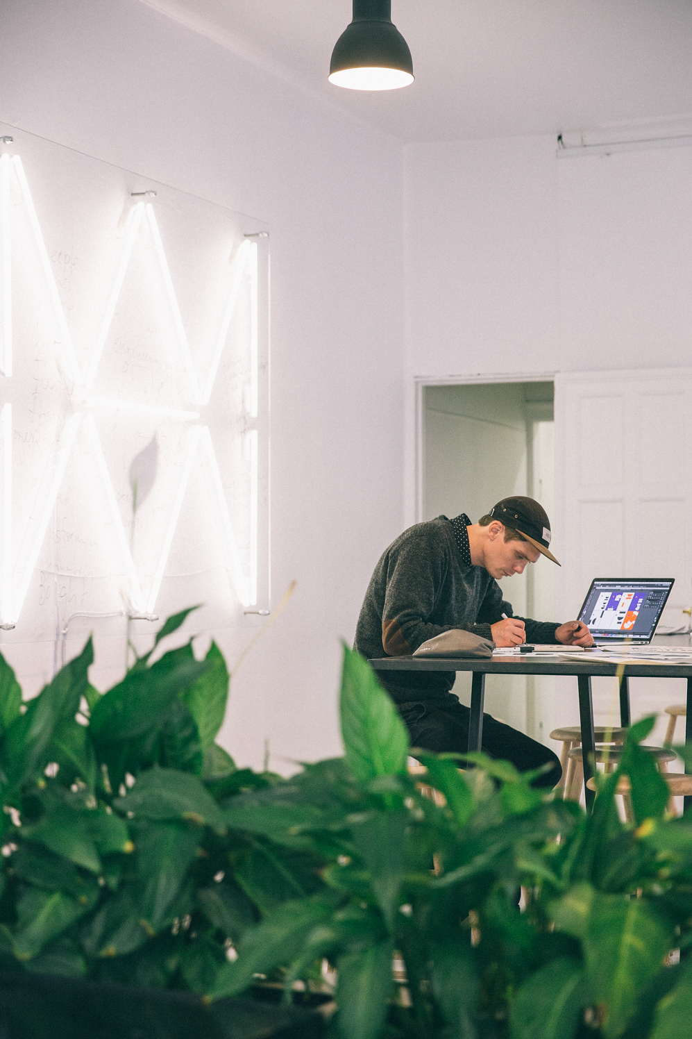
I don’t have one toolbox. I sketch a lot and over time you start to develop something that is usable. Design is very much about having a good idea to start with. If you have a good idea, you can create something simple, because you’ve found the essence of the message. The difficult part of being a designer is that sometimes you can get a good idea in five minutes, but most of the time it takes much longer.
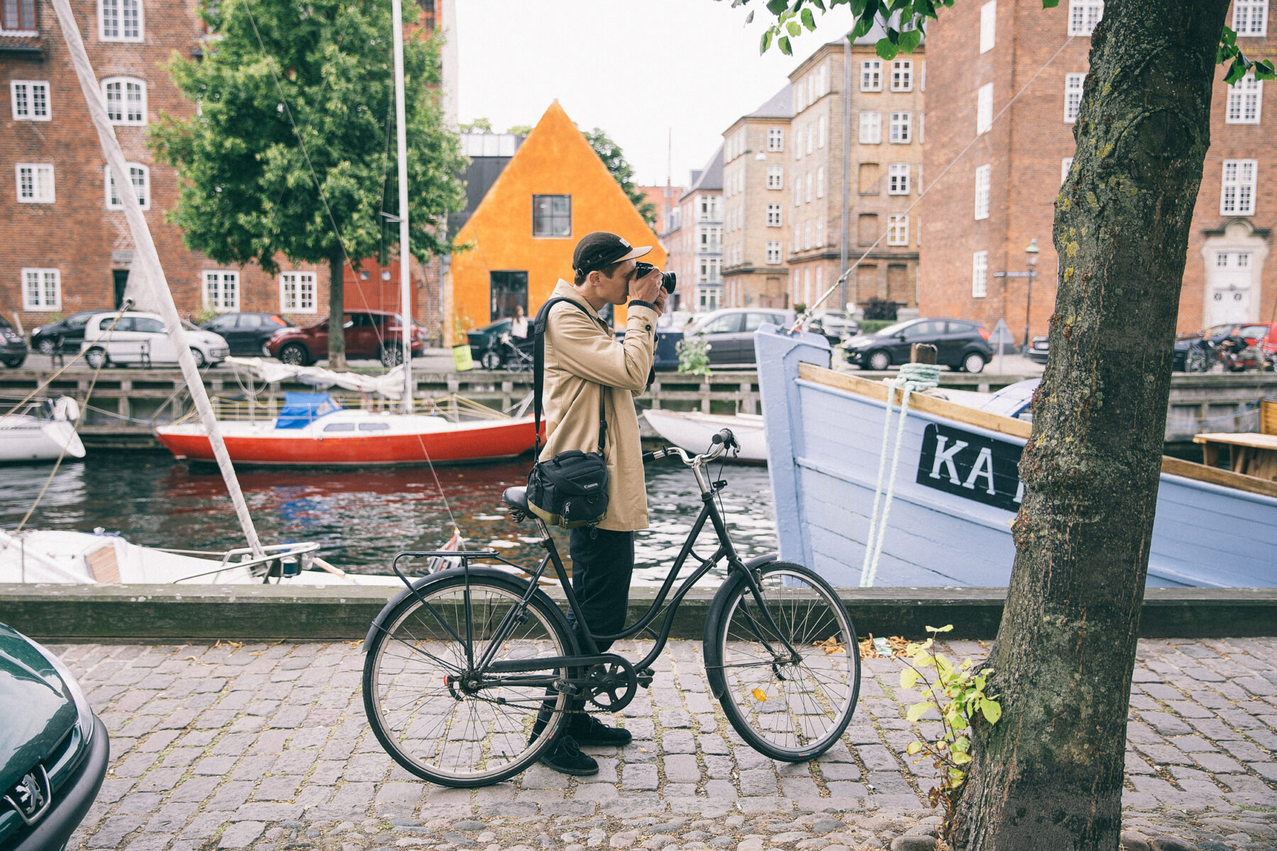
Finding inspiration can also be very random. I don’t have a specific place to go, I just like walking around the city with my camera, taking photos of architecture or textures – anything really. I also go to a lot of exhibitions and galleries, and get a lot of inspiration from the artwork I see. I love to travel and experience new cultures and their way of communicating.
-
Do you still spend a lot of time sketching?
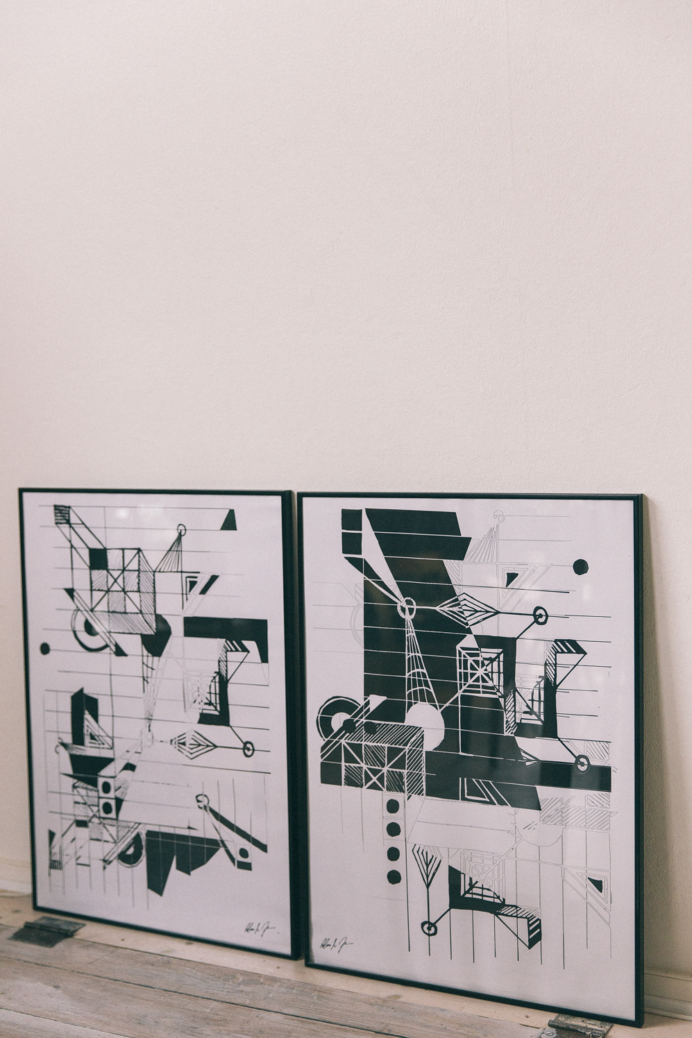
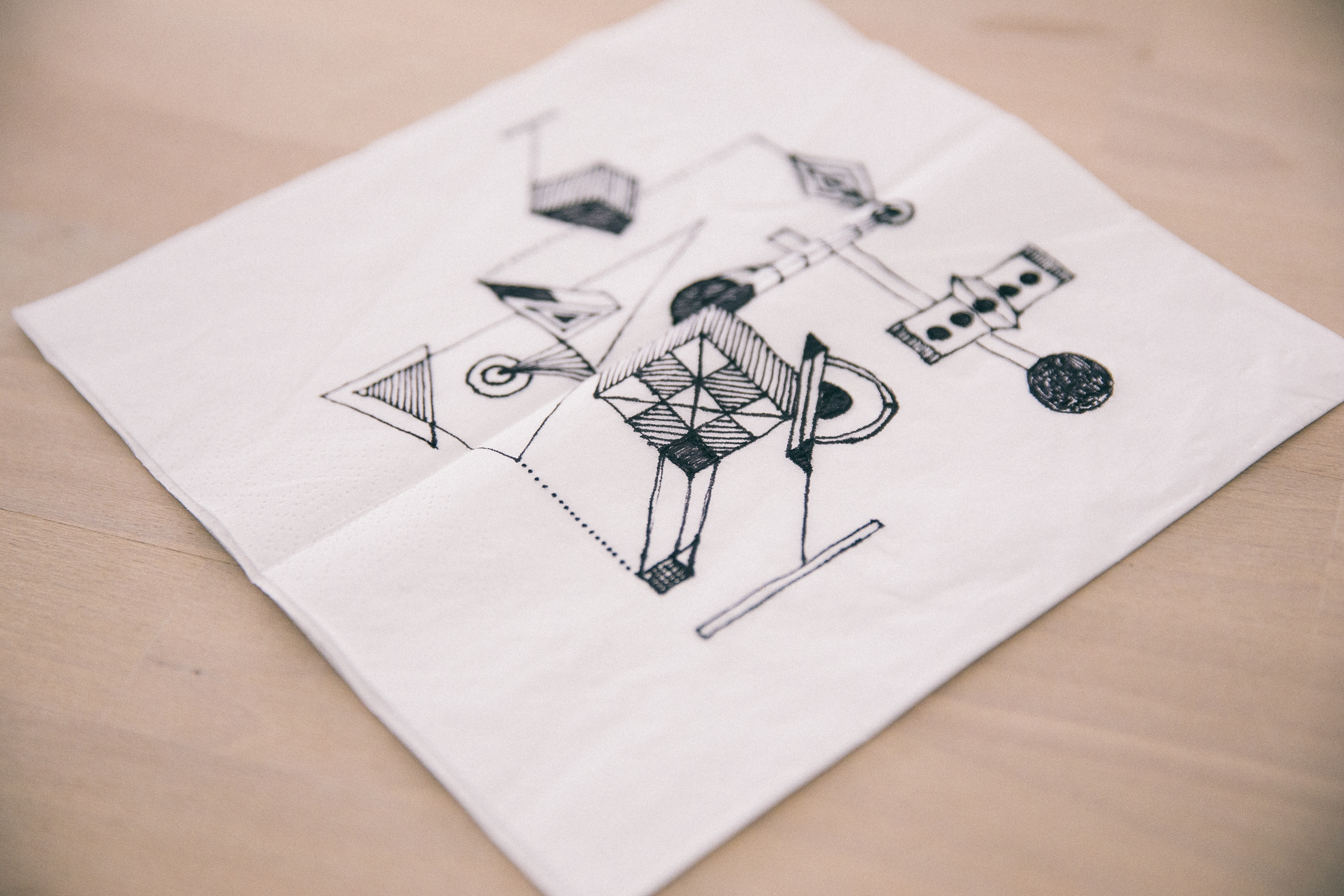
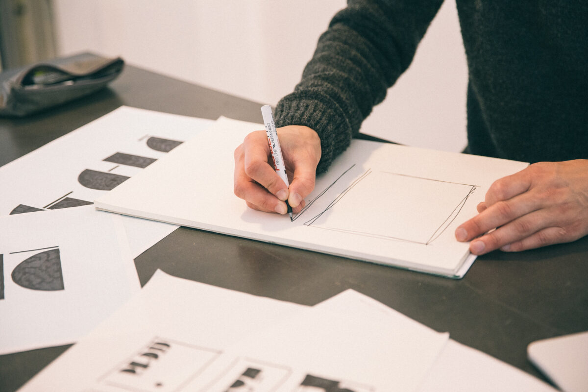
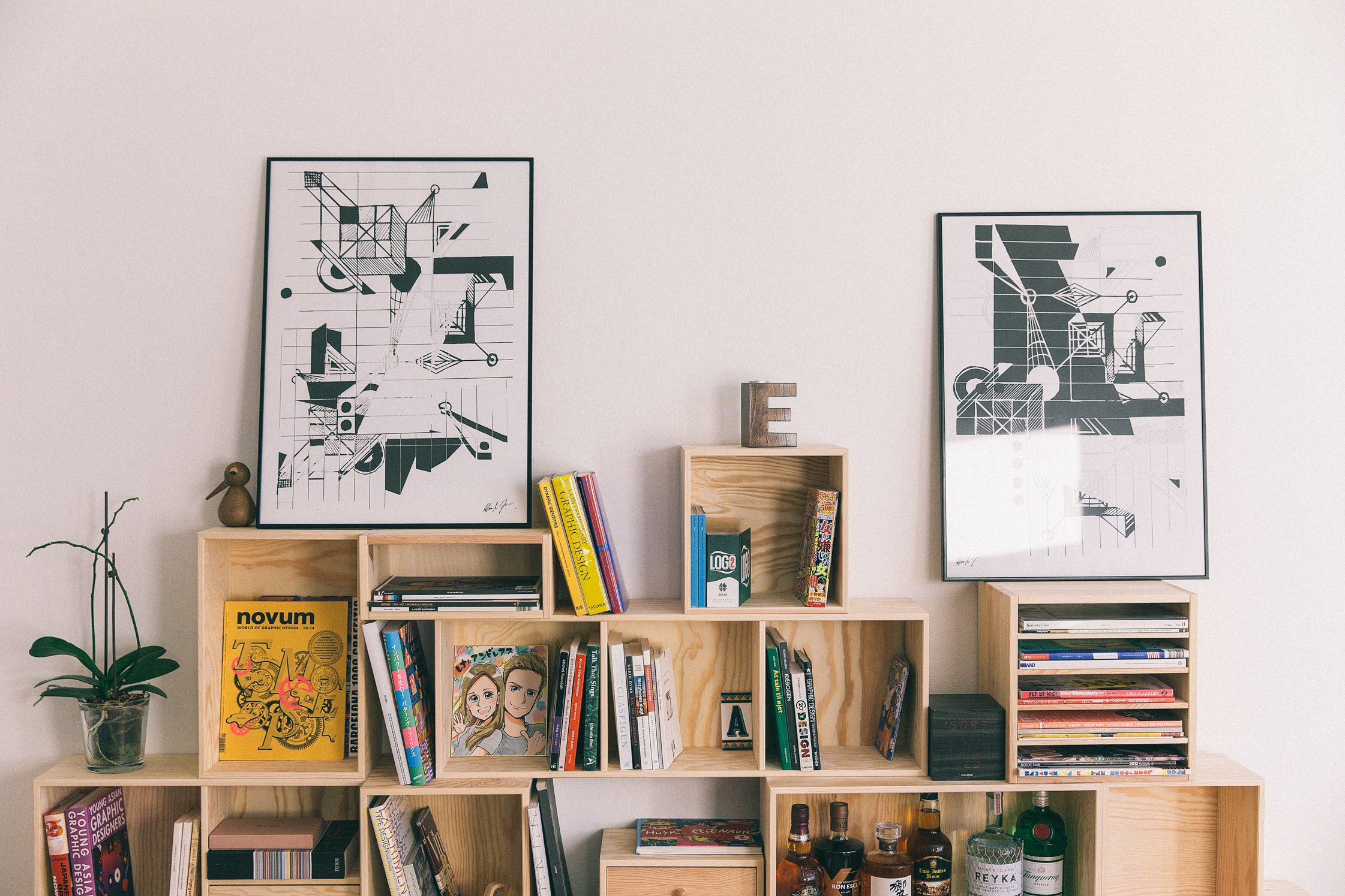
I still sketch, but not as much as I used to. I want to return to pen and paper but increasingly my work is on a computer. Once, in a boring meeting, I started to sketch some ideas on a napkin that were inspired by a science fiction film I had seen. I didn’t think too much about it, but when I got home I decided to do something bigger with it, and I ended up making two big posters from the basic idea, which in the end became my BW poster series.
-
Your work seems to belong to a Danish school of thought. How would you describe the Nordic aesthetic?
I think the whole “less is more” minimalist feel in Scandinavia has a long history. In the 1940s and 1950s, we had Arne Jacobsen and other furniture designers who worked a lot with very clean lines, simple forms and cutting away all excess. This Nordic style is still present, but I think it’s starting to fade out because people are getting a little tired of these highly simplified expressions – they want to be more crazy.
-
Your personal work is clean but with depth. Does that make sense?
I love contrasting sizes, colors and textures. I often use bright colors and rough textures, such as concrete, as materials for juxtaposing soft and hard elements. Contrast is always nice for the eye, and I am intuitively drawn to it.
-
What are you trying to communicate through your print work?
I work in a geometric and abstract universe, but I can’t really describe how. I make the posters because they are works that I like myself, and I don’t think much about the user or the buyer when I make them. They are more affected by what I have felt during different periods of my life. I had a period where I only used black and white because I didn’t like colors.
-
Tell us about one of your posters?
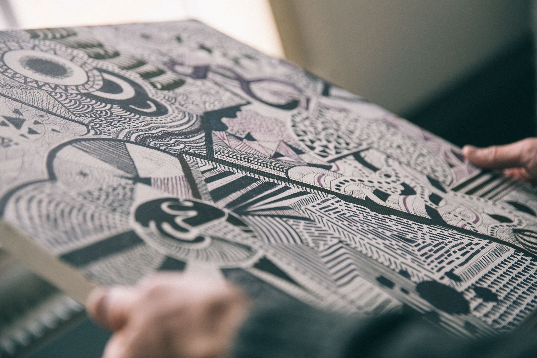
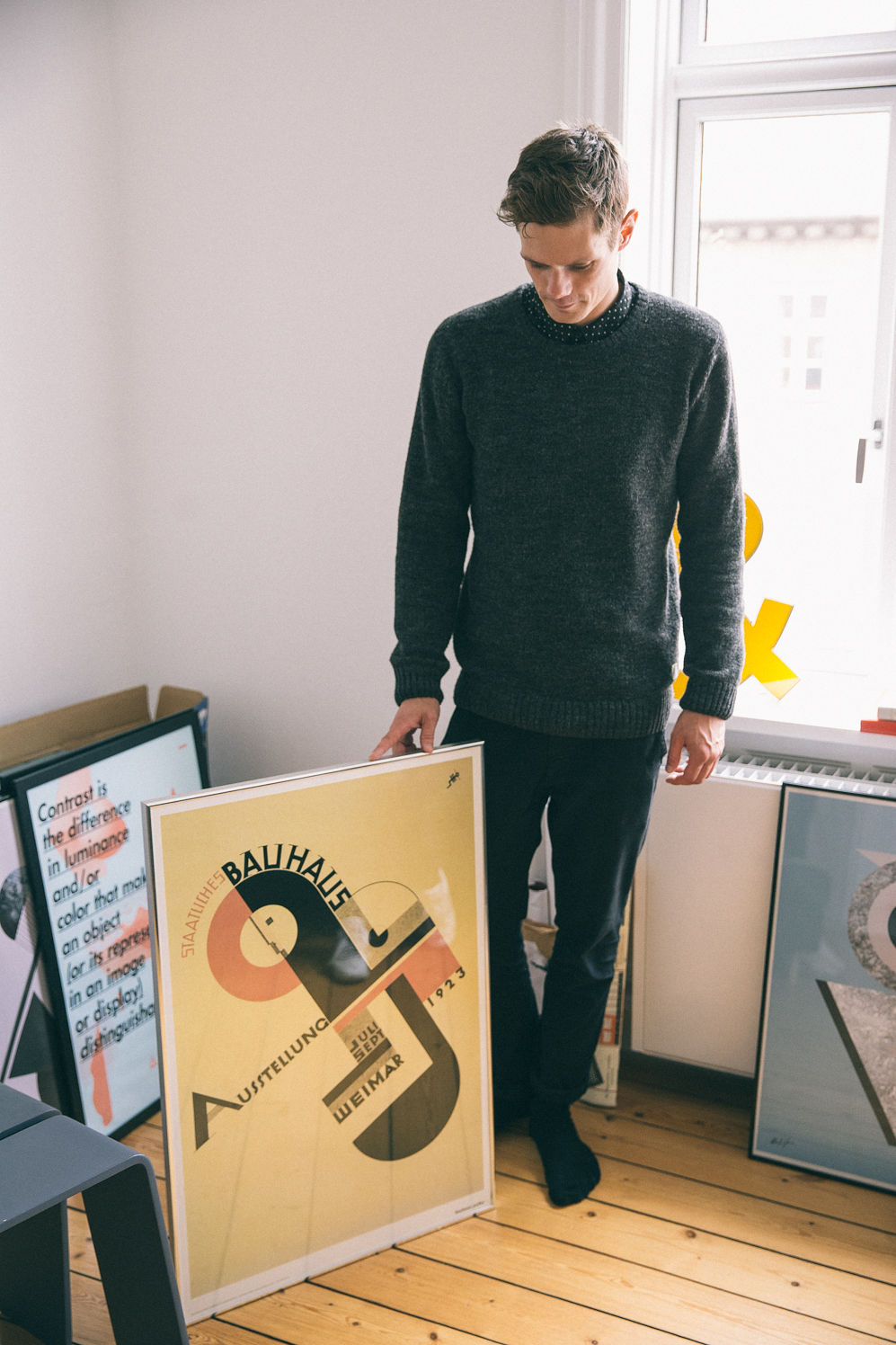
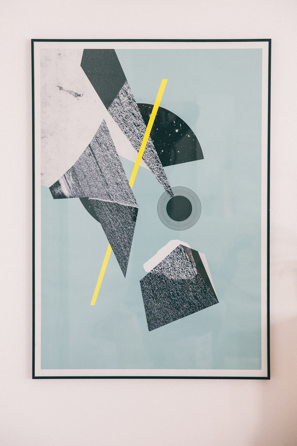
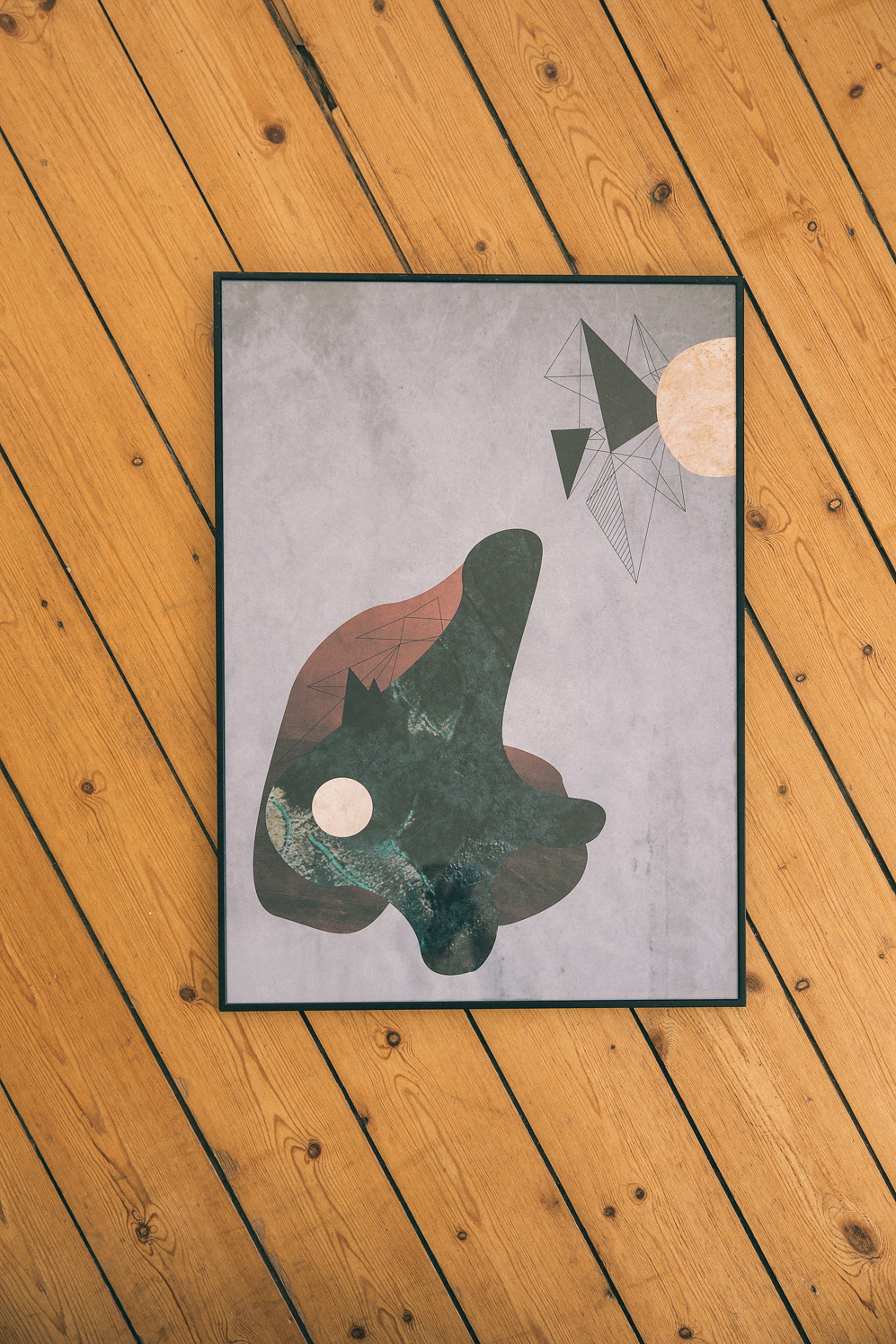
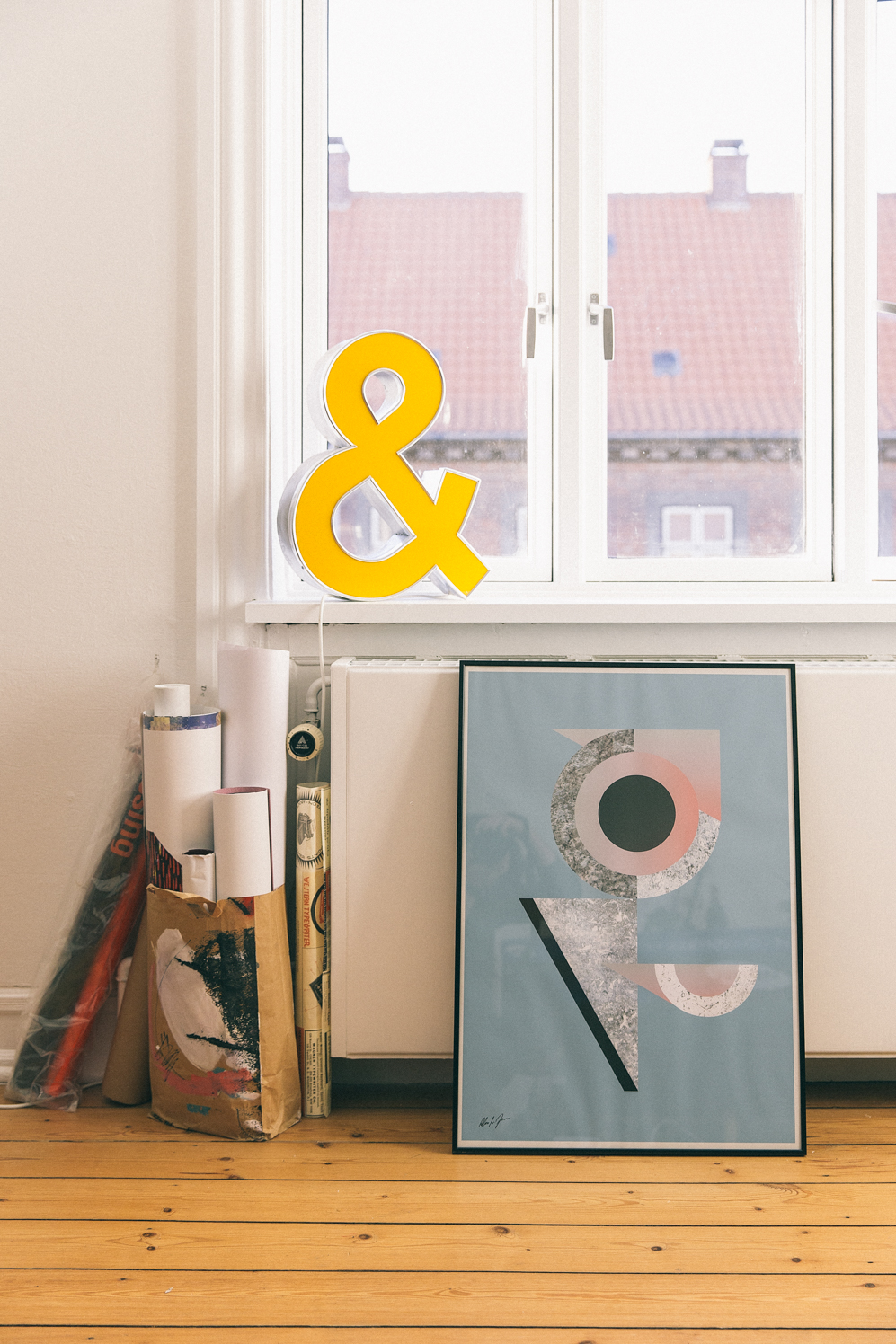
This one is called Bau3, which is part of a series of posters that is inspired by the geometric Bauhaus movement. For the texture, I used photos I shot while I was on a holiday. I made them black and white in order to create a contrast between the rough elements and the clean background. When I make these types of posters, I create the different elements on a computer and move them around until, after a few days, I manage to find the right balance. It’s often the small details I spend the most amount of time on. It’s a combination of colors, textures and forms. It’s a compositional game, to create tension by placing the elements in the right space in relation to each other. But it can’t be too perfect – there also has to be a little imbalance.
-
How do you find the balance between making something that is graphically interesting to look at, while also conveying meaning?
It’s often difficult to make something clean and simple while also capturing the essence of a good idea. It takes a lot of time, and the simple designs are often the hardest. Graphic design and visual communication are amazing because they’re a language that everyone can understand. Colors, shapes and images speak to our emotions. Design can tell a story, but great design can tell the right story.
Thank you, Andreas, for sharing your story with us and leading us around the city that is such a source of inspiration to you. Find more about Andreas’s graphic design work on his website.
This portrait has been produced in collaboration with Juniqe.com, the online marketplace that connects art lovers with emerging artists from all over the world. In their Artist Stories series, they visit artists in their studios to discover their creative processes. To get to know Andreas a little better, spend some time with his work.
Photography: Kasper Løftgaard
Interview & Text: Peter Stanners
