
When we think about design magazines we think about publications that cover the subject of design; specialist titles that examine the latest developments in graphics, architecture, fashion or products, or any combination of those.
We’re used to reading design journalism in the form of interviews, profiles and reviews along with news and opinion. Which can be fine and good, if a little repetitive, but it’s also satisfying to encounter magazines that stretch the meaning of design magazine a little further. Dutch title MacGuffin comes to mind, a beautiful magazine about ‘The Life of Things’ that offers a real-life take on design and its execution that extends beyond the celebrity designer interview and obsession with effects and trends.

But there is also a tradition of experimental magazine that stops even further away from the usual. Sometimes it can be refreshing to use design itself as criticism, to let action speak louder than words. And that’s the case with new publication SPIN/Adventures in Typography.
Conceived and produced by London studio Spin, and published under their Unit Editions imprint, the richness of the physical production of the magazine matches its provenance. The 52 pages of smooth off-white Fedrigoni paper feel sufficiently heavy while remaining eminently flickable. There’s a slight see-through between pages that helps define the publication as a document of work in progress rather than finished pieces. A cut down cover of book cloth fabric (available in a choice of three colors) and a heavy, silk-screened plastic envelope complete the physical celebration of print that’s always central to a Unit project. Every aspect has been researched and tested to arrive with a format perfect for the content.


“In this magazine we get a glimpse of the raw excitement for typography that underlies that control.”
Inside, the pages contain a series of experimental typographic experiments. Carefully reproduced in stark black and white, these are indeed, adventures in typography. The Spin team have managed to express the joy of typographic experiment with a freedom and lack of restriction not often associated with their work. Sometimes the pages seem to offer insight into an imaginary design project, with versions of similar shapes almost developing to become something more definite; other pages carry single, bold characters from an invented alphabet. Every piece is well worked—they don’t feel like random one-offs but highly developed designs for fantastical projects.
Spin’s design usually works to a very measured and controlled aesthetic; in this magazine we get a glimpse of the raw excitement for typography that underlies that control.
In his introduction, Spin Creative Director Tony Brook explains the project was born of “enthusiasm rather than commercial or practical imperatives.” He sees the publication as an extension of a number of Spin projects that look to express the studio’s broader culture and approach. These have included events, exhibitions, Spotify playlists and even a specially brewed beer, as well as their vast SPIN: 360° monograph of last year.
-
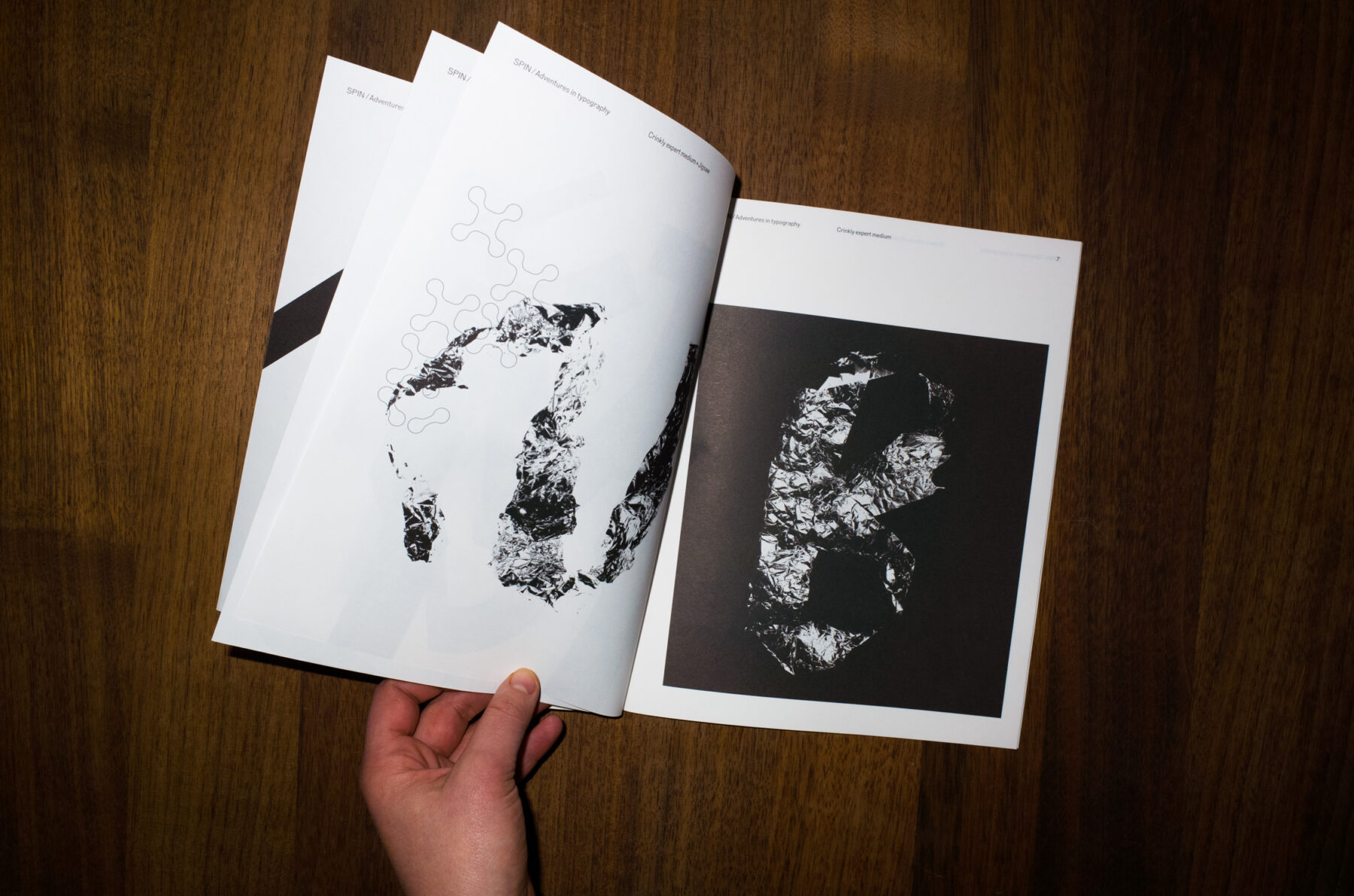
Crinkly expert medium + Jigsaw (left) Crinkly expert medium (right) -
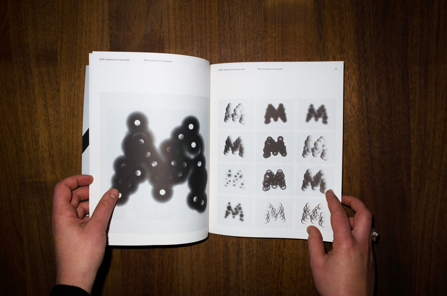
Mmmiscellaneous frogspawn -
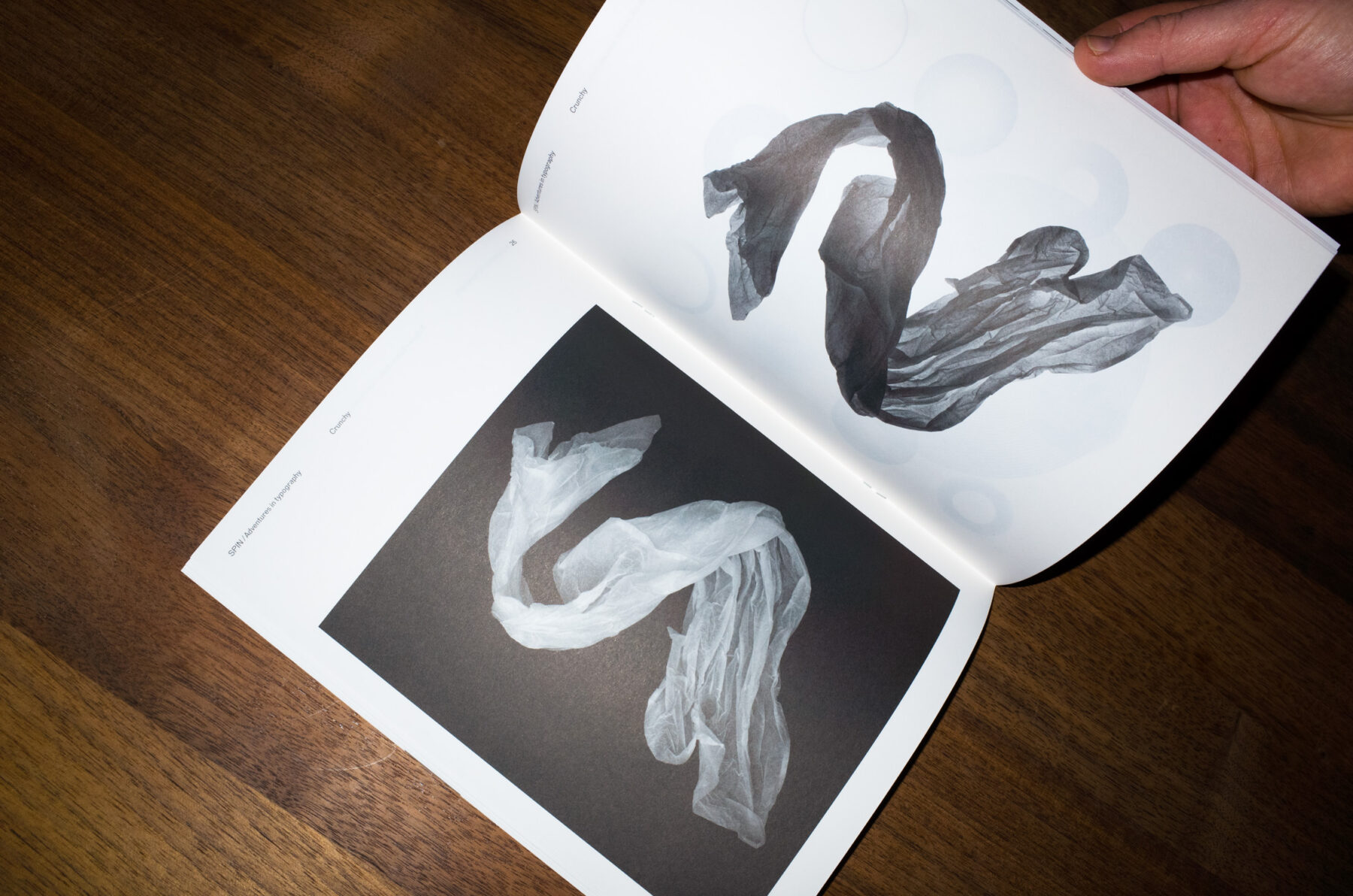
Crunchy -
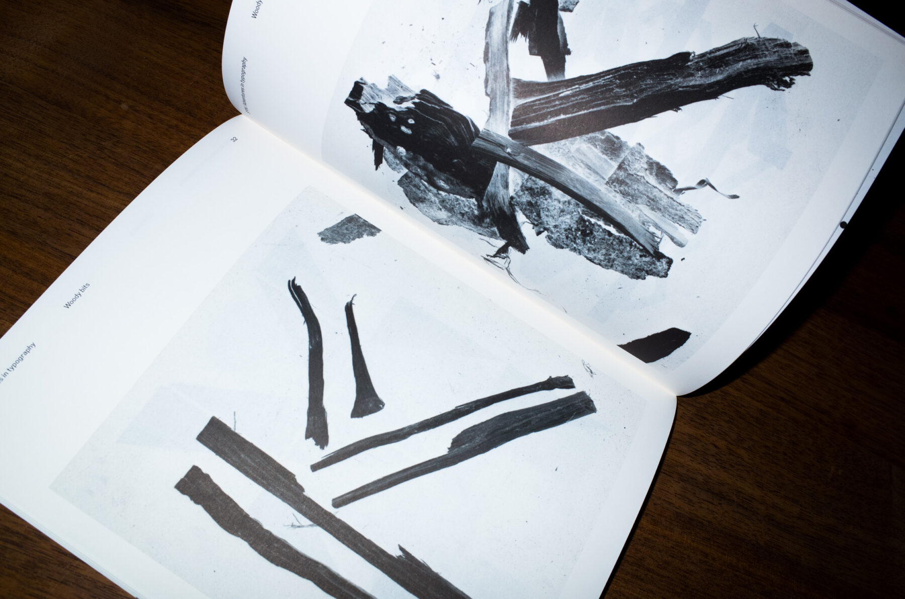
Woody bits


Owners of that book will find not only that the new magazine uses the same page size, but that the two publications are designed to complement each other—even their signposting systems are identical. This deliberate visual cue works well, and adds to the fun—absurd titles are given to each experiment in lieu of the serious project titles of the book.
But for all the fun being had, SPIN/Adventures in Typography asks serious questions about current typography and visual language by focusing on practice instead of theory. Both visually arresting and intellectually challenging, it offers a thrilling critique of contemporary graphics in a manner no other publication is currently attempting.

Magazine fiend Jeremy Leslie is the founder of online journal magCulture. With 25 years of experience in editorial design, Jeremy is dedicated to finding the best magazines out there. In a series that celebrates contemporary indie publishing on FvF, Jeremy will be sharing his thoughts on a selection of old and new magazines with a strong focus on design and editorial content.
Text:Jeremy Leslie from MagCulture
Photography: Robert Rieger