
Data has long faced a serious PR crisis. The word alone often conjures images of dense excel spreadsheets and incomprehensible graphs and figures. That’s not to mention the looming threat of Big Data, which has quickly become public enemy number one. A new guard of creatives, however, is reexamining the potential and significance of data. Through installations, artworks, and exhibitions they are seeking to find beauty in numbers and connect with audiences on a more human level.
Designer Giorgia Lupi (Pentagram and Accurat)
Some of Giorgia Lupi‘s earliest memories are of her grandmother’s tailor shop in the northern Italian town of Mirandola. Her parents would drop her off there on their way to work and she would amuse herself by counting and cataloging all the different buttons and threads. “I would organize them by color and size, or whether a button had two or three holes,” she says. “Building these visual taxonomies gave me so much pleasure.”
Decades later, Lupi is still collecting and cataloging data. But she’s moved on from haberdashery to look at themes including global wealth inequality, microplastics, and racial justice. “I see the world through layers of data,” says Lupi, who works today as a partner at Pentagram, the world’s largest independent design consultancy. Her work seeks to change the way we engage with data and free it from dull connotations of excel spreadsheets and complicated graphs. The aim is to connect with audiences on a more human level. So far, that’s included everything from a series of colorful sculptures at New York Botanical Garden that represent the impact of food production on the planet to a hand-drawn chart mapping Black Lives Matters protests across the USA.
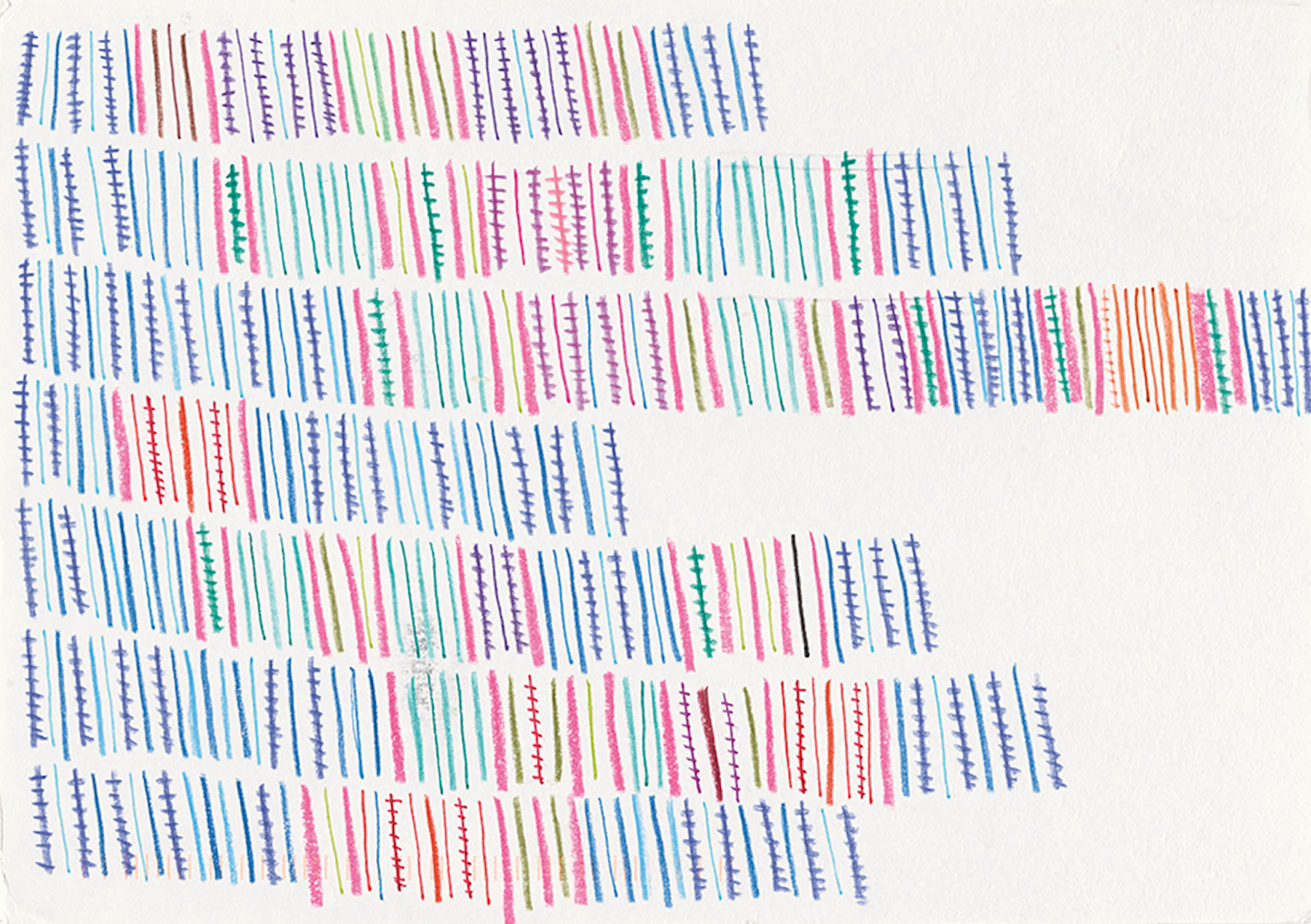
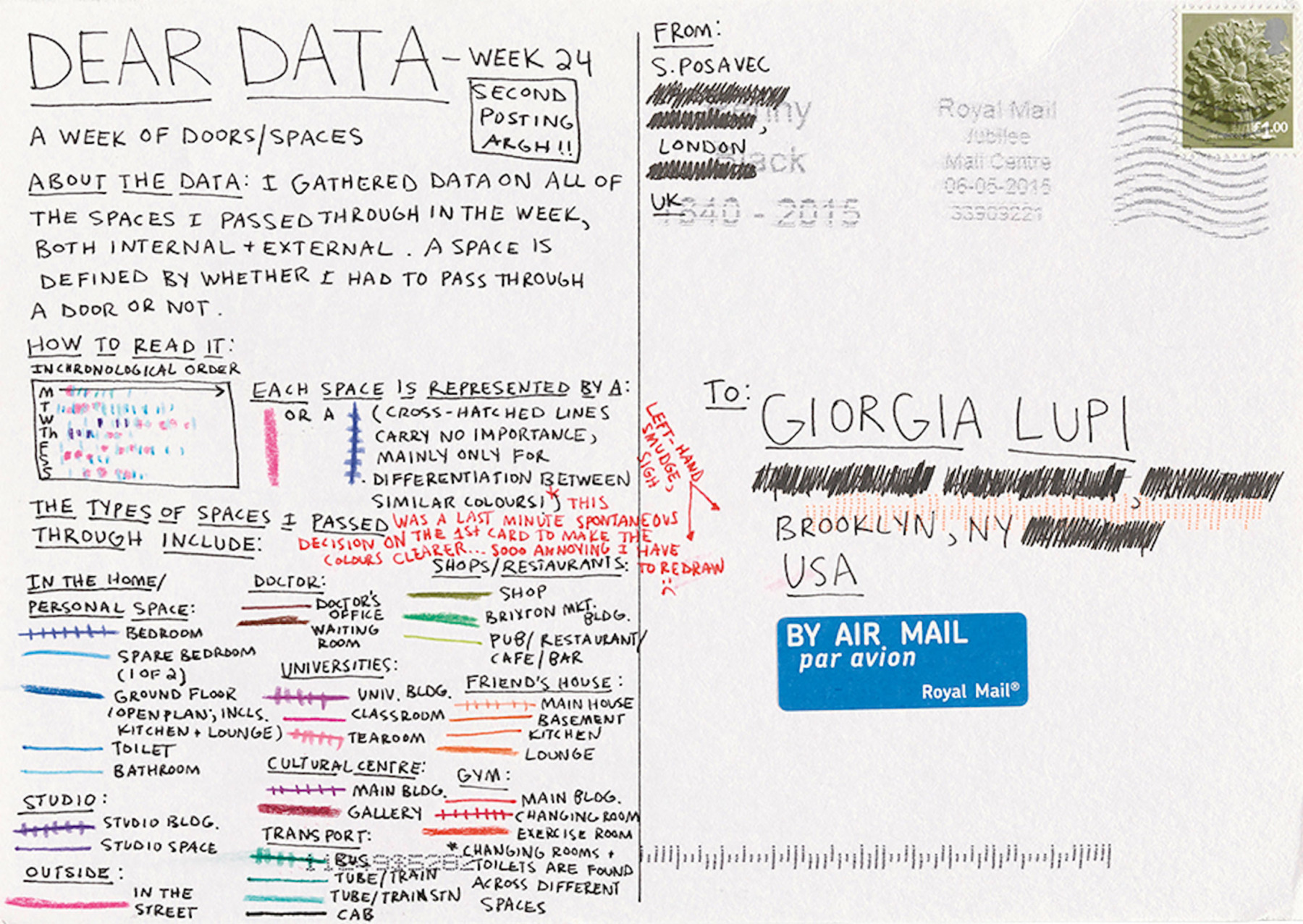
For Lupi, data is a means of storytelling. But it’s not just grand narratives she’s looking to represent, her work illustrates smaller personal histories too. For her project Dear Data, she teamed up with artist and author Stefanie Posavec and the two exchanged postcards every week for a year, with Lupi sending hers from her home in New York to Posavec in London. Their colorful drawings tracked things like the number of times they had laughed that week (and what sparked it) or how many times they had said goodbye. “In order for data to be faithful to human nature, we have to recognize what numbers really stand for,” says Lupi. “And in many cases, that’s our messy and unpredictable lives.”
Giorgia Lupi’s Dear Data project
-

For Dear Data, Giorgia Lupi and Stefanie Posavec sent postcards with illustrations of personal data to each other every week for a year. -

-
-


Lupi explains that experimenting with unusual data visualizations is no modern phenomenon. “In the second half of the 19th century, an English physician called John Snow drew a map of the cholera outbreaks in London,” she says. “It’s a really famous example of data visualisation.” These kinds of public health crises, Lupi believes, force us to confront data sets more regularly and apply their findings to our everyday lives. “Over the course of the pandemic, we moved from being a population where only a few of us cared about data to one where every single person relied on charts and numbers that would help us make decisions about whether to leave our homes. I would hope the upshot of that is that we have become a slightly more data-savvy population.”
“I see the world through layers of data”


Pau Garcia (Domestic Data Streamers)
Fighting indifference towards data is also the mission of Barcelona-based creative studio Domestic Data Streamers. “As Swedish statistician Hans Rosling said, “few people will appreciate the music if I just show them the notes, most people need to hear it,” says the studio’s founder Pau Garcia. “That’s what we do. Instead of showing the data, we make people experience it, smell it, listen to it, touch it, feel it. Our focus is on making information something deeply embedded into the human experience. And this approach always makes a difference.” Garcia’s team at Domestic Data Streamers spans data scientists, designers, journalists, coders, and psychologists. “Most are outcasts from their fields looking for a more transdisciplinary approach,” he says. “We started out nine years ago as just four friends but have since grown to become an art studio of 25 people working across 4 continents.”
Much of their work involves building installations and exhibitions that provide audiences with experiences that are both immersive and informative. Recent projects include Conversations on Suicide, a portable cube fitted with 62 telephones—the same number of people who attempt to end their lives each week in Catalonia. The installation moves this number from the abstract to the tangible; 62 goes from being just a number to a series of voices with their own tales of struggle that can be related to on a very human level. The idea was to confront the stigma that surrounds talking about mental health and the cube was positioned in various public spaces where passersby can pick up a receiver to listen to a recording from someone who has experienced this kind of psychological crisis.


There was also the exhibition Domestic Data Streamers organised to mark 35 years since the foundation of Catalan food bank network Banc d’Aliments. The focus was on highlighting the problem of food waste. The exhibition included installations like a 228-kilo rubbish container representing the quantity of food that is thrown away each minute in Catalonia. There was also a laid table with plates embossed with pie charts showing the numbers of people at risk of going hungry in Spain. In 2018, Domestic Data Streamers also launched their own Master’s program in Data Design at Barcelona’s Elisava School of Design and Engineering where students can pick up the tools they need to explore and innovate in this field.
“Instead of showing the data, we make people experience it.”

Zainab Aliyu and Galen Macdonald (School for Poetic Computation)
New York’s School for Poetic Computation has also made it their mission to educate a new generation of designers in the artistic potential of data. The school was founded in 2013 by a group of artists and educators looking to explore the intersections of code, design, hardware and theory. “The idea was to help people move away from thinking about coding as a productive tool for capitalist outcomes and start exploring how we can rethink these tools for more critical and artistic expression,” says co-director Zainab Aliyu, who is also a former student of the school. “In this way, it’s an act of resistance.”
Since the pandemic, their teaching has gone almost entirely online though there are still occasional residences in spaces in New York. Semesters are 10 weeks long and each cohort includes some 18 students. Their classes include the likes of An Artist’s History of Computer Viruses and Malware (described as being “for artists who are interested in incorporating terminal commands and browser extensions into their respective practices”) and Scrapism, which is taught by artist Sam Lavigne. “Sam’s class basically starts from the premise that power structures reveal themselves online in ways that they’re not aware of,” says Galen Macdonald, another of the school’s co-directors. “And that is an amazing starting place for satire and mapping projects as well as all manner of artistic interventions.”
The school and its team are the hippies of the data world, interested in information and technology not for its own sake but for its potential for beauty, mystery, and activism. “The world we’re living in today is so expansive and often incomprehensibly extensive. This very often leads to unchecked power,” says Aliyu. “We look at the monopoly of Big Data early in our critical theory classes and think through ways to interact with data that are more liberatory. By learning how these structures are built, we can also begin to imagine what might lie outside of them.”

This Deep Dive explores the potential for data to challenge preconceptions and widen our understanding of the world. If you’re interested in reading more about data, we recommend reading our profile of Mona Chalabi.
Text: Hester Underhill
Images courtesy of Giorgia Lupi, Pau Garcia, Zainab Aliyu, and Galen Macdonald